
Kim Seoyoon / 0357755
PRJ 64904 / Major Project I / Bachelor of Design (Hons) in Creative Media / Taylor's University
Task 3 / Concept Presentation
TABLE OF CONTENTS
INSTRUCTION
TASK 3 – Concept Presentation
Week 6 / Consultation & Final Improvements
Week 7 / Final Concept Presentation Week
FINAL SUBMISSION
FEEDBACK
REFLECTION
QUICK LINKS
INSTRUCTION
Module Information Booklet
Task 3 – Concept Presentation (40%)
Timeframe: Week 06 – 07 (Deadline Week 7)
In task 3, we are to present how our design solution effectively addresses a specific need in the targeted audience, utilizing a newly created product or service that brings unique social, cultural, and economic value.
For final submissions, we are to create a presentation slide that explains the project details based on the proposal proposed in earlier weeks. We are also to create design deliverables and their relevant output.
TASK 3 – CONCEPT PRESENTATION
Week 06 / Consultation & Final Improvements

Fig 1.1 Week 5 Updates Compilation, Week 6
In week 6, we showed our updated designs based on the feedback from week 5 to Ms Vitiyaa. Overall, Ms Vitiyaa commented that our designs were too clean for a murder mystery genre, especially in texture, and she mentioned that using a realistic blood texture would enhance the quality higher compared to using a simple minimalistic blood effect.
This also applied in the role card designs, and she recommended adding blood stains to the characters and using a mugshot-type layout for the card composition so that the characters seem more related to the mysterious murder in the narrative.
For the Info Booklet design, she instructed us to be careful with typographical errors like orphans and readability issues when laying the text lines. I was advised to shorten the text boxes so that it is easier to read by the players.


Fig 1.2 Role card & Logo Feedback Notes by Ms Vitiyaa, Week 6
For our logo, she commented that the reading of WHO 'R YOU? resembles an inappropriate word, and advised us to change the placement of the letter 'R' next to 'U'. She also commented that we could utilize the magnifying glass better for the logo by creating an illusion effect.
Revising Designs
After the feedback session, we listed down the parts that need more improvements. The below list contains each member's task:
1. Logo (Carmen)
2. Role Card Design (Rafa)
3. Board Design (Graciella)
4. Mini Game Card Design (Seoyoon)
5. Info Booklet (Seoyoon)
6. Deliverables (Seoyoon)
7. Prototypes (Each part)


Fig 1.3 Old Paper & Blood Stain Texture, Week 6
We also selected one image each to use for texture and blood effects for most of the game components. I tested the paper texture on the information booklet and we all agreed on using the setting for darken blending mode with 33% opacity.
1. Logo Revision by Carmen
For logo design, we decided to increase the size of the magnifying glass and bound it around the text. Carmen also helped to create a soft gradient shadow and a zoomed-in illusion on the letters 'W' and 'H' to enhance the depth of volume.

Fig 1.4 Revising Logo on Illustrator, Week 6
Fig 1.5 Revised WHO 'R U? Logo (PDF), Week 6
2. Role Card Revision by Rafa
For role card design, referring to Ms Vitiyaa's feedback, Rafa newly created a mugshot layout with different colours. After some discussion, we decided to go with the pink border (centre) to match with mini-game cards.

Fig 1.6 Role Card Design Drafts, Week 6
-01.jpg)
-09.jpg)
Fig 1.7 Revised Role Card Design, Week 6
Fig 1.8 Revised Role Card Design (PDF), Week 6
3, Board Design & Heal Card Revision by Graciella
For the board design, Graciella applied the old paper texture and replaced the logo with the new logo Carmen created.

Fig 1.8 Revised Role Card Design (PDF), Week 6
Graciella also helped to apply textured layers and blood stains for the heal card design.


Fig 1.9 Revised Heal Card, Week 6
Fig 1.10 Revised Heal Card (PDF), Week 6
4. Mini Game Cards Revision
For mini-game cards, Rafa and I decided to go with a standard poker card size as the default size of our playing cards. I rearranged the contents again on the new canvases and applied the textures.


Fig 2.1 Mini game Sizing & Process on Illustrator, Week 6


Fig 2.2 Mini game Card Before & After, Week 6
Fig 2.3 Revised Mini game Cards Compiled (PDF), Week 6
Fig 2.4 Revised Mini game Cards (PDF), Week 6
In addition, I also created the dice and playing mascot for our game. As planned we were to use a coin instead of using a dice for the game. Once the player throws the coin and catches it, if it lands on heads, the player moves 1 step, and 2 steps for tails.

Fig 2.5 Coin Design, Week 6
I also used the 3D object tool in Illustrator to create a simple mock-up for the design.


Fig 2.6 Coin Process & 3D Mock-up, Week 6

Fig 2.7 Mascots Design, Week 6
5. Info Booklet Revision
For the information booklet, following Ms Vitiyaa's feedback, I replaced the simple blood stain effect from the previous design and added the realistic blood stain. At first, I tried using red for the actual blood colour, but after some discussion among group members, we finalized the idea of maintaining the colours from the colour palette (pink) so that the overall design was consistent.

Fig 3.1 Trying out different colours for booklet cover, Week 6
I also prepared some visual elements using the designs my group members created for the components page. Initially, I laid them out flat on the page, but due to the texture being the same on both the cards and the booklet page, I added a layer of shadow underneath these visuals to make them stand out on the pages.

Fig 3.2 Preparing Visual Elements on Adobe Illustrator, Week 6
For the page design, I removed the pink borders and applied the paper texture onto the spread. I also made sure there were no more orphans in the texts.
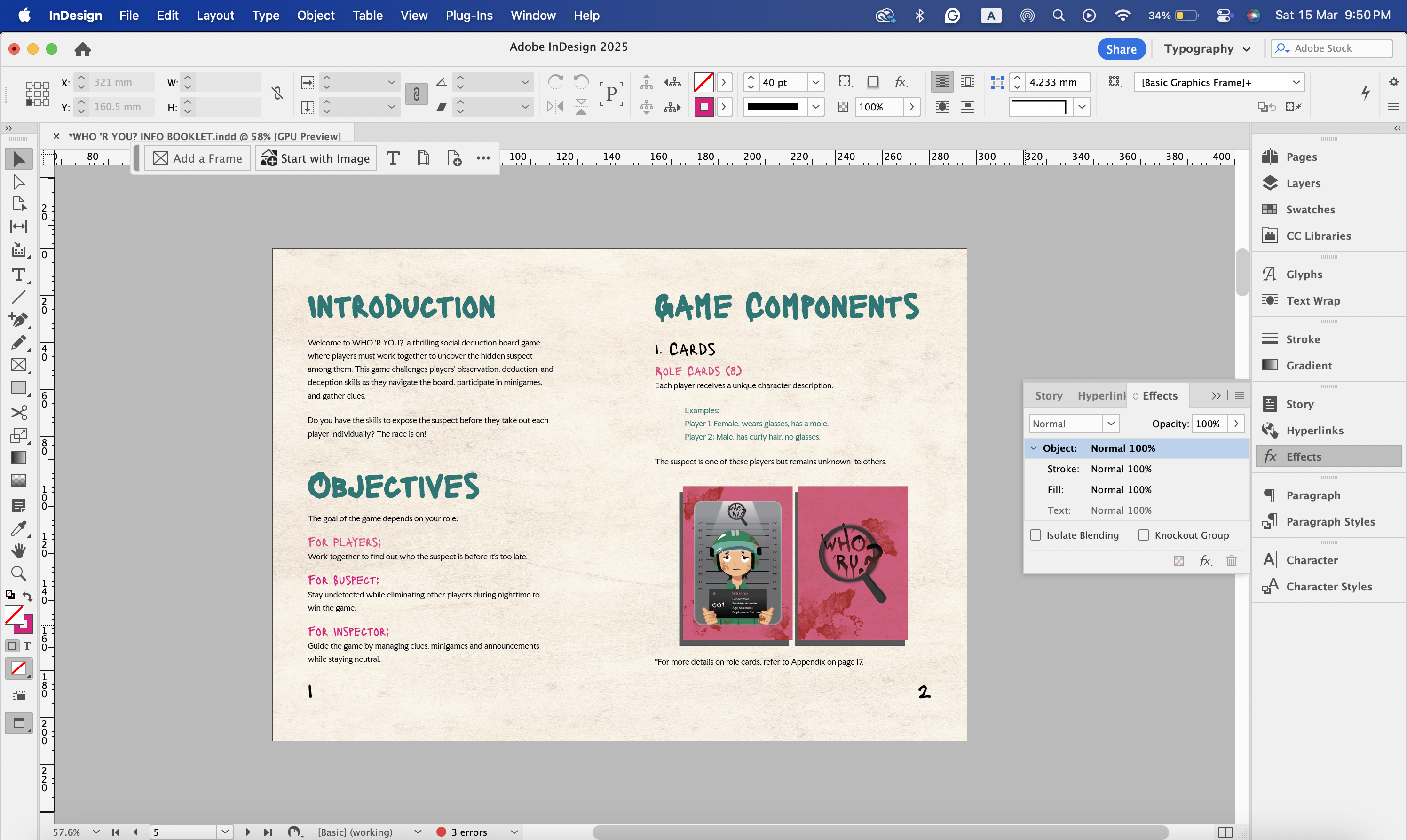
Fig 3.3 Editing on Adobe InDesign, Week 6
Fig 3.4 Revised Information Booklet, Week 6
For wider options of usage, Carmen suggested that we should publish an online version of the booklet so that players can read it online. I thought using a FlipHTML would be a great option for this so Carmen helped upload our PDF file on the website. Below is the link to our online publication.

Fig 3.5 Info Booklet Online Publication on FLIPHTML, Week 6
6. Deliverables
For deliverables, I gathered up everyone's design and created several mock-up applications to showcase in the final presentation.
- Poster
Graciella helped make the posters for the exhibition, and I used a mock-up file with torn edges so that it gave a more worn-out look.


Fig 4.1 Poster by Graciella, Week 6


Fig 4.2 Poster Mock-up, Week 6
- Role Cards
I used Rafa's role card designs to create a playing card mock-up. For the card box design, I used Illustrator to create an inverted version of the main box packaging to give some variety.

Fig 4.3 Playing Cards Box Design, Week 6


Fig 4.4 Role Cards Mockup Process on Photoshop, Week 6

Fig 4.5 Role Card Mock-up, Week 6
- Mini-game Cards
Once again I used the same packaging of playing cards for mini-games as they can be stored together.


Fig 4.6 Mini-game Mock-up, Week 6
- Information Booklet
Below is the mock-up for WHO 'R U?'s information booklet.

Fig 4.7 Info Booklet Mock-up, Week 6
- Banner Stand
For the banner stand, I created an advertise-like design for our board game. I decided to use some green for this design to give contrast among other designs.


Fig 4.8 Banner Stand Design & Process, Week 6

Fig 4.9 Banner Stand Mock-up, Week 6
- Exhibition Booth
Below is the mock-up for our exhibition booth.


Fig 4.10 Exhibition Booth Mock-up, Week 6
- WHO 'R U? Packaging Box
For our box design, I used the colour black to keep the first impression dark and mysterious and added a pink accent colour to make our design more vibrant. The box packaging also matches our information booklet.


Fig 4.11 Board Game Packaging Box Design & Process, Week 6

Fig 4.12 Board Game Packaging Box Mock-up, Week 6
For prototyping, Graciella and Rafa printed the board and cards to stick on the cardboard paper that Carmen prepared. I was in charge of printing the info booklet.


Fig 5.1 Printings & cardboard for prototypes, Week 7


Fig 5.2 Our Prototypes :D, Week 7
Week 07 / Final Concept Presentation Week
Fig 6.1 WHO 'RU? Task 3 Presentation (Version 1), Week 7
Task 3 Presentation Feedback
In week 7, we had our final presentation. Ms Vitiyaa commented that our overall presentation had a good flow, but we lacked in the progress explanation on the logo development and logo presentation in black and white. She advised us to elaborate on each step of development before the submission.
On a final note, she mentioned our final logo seems a little unbalanced and could be improved if we rearrange the handle's placement to the opposite side.
Final Adjustment Before Submission
For the final adjustment, we decided to modify our logo a little and replace it on all components.
1. Logo
I began modifying the logo by switching the handle's side to the left and then shortened the handle a little to make the overall look more compact.


Fig 6.2 Shortening Handle, Week 7
And then I made the letter 'W' thicker so that it matches with the rest of the letters. I also moved the question mark a little apart from the magnifying glass so there are no tangents.


Fig 6.3 Increasing 'W' thickness & tangents adjusting, Week 7
After confirming and finalizing the logo, I tried applying the original black and white colour to the logo, but we fixed our idea of using the original grey + black and red for the coloured version of our logo.

Fig 6.4 Trying out Logo Colours, Week 7
Fig 6.5 Finalized Logo Design, Week 7
I also created the logo Clearspace based on the letter 'O' of our logo.
Fig 6.5 Logo Clearspace, Week 7
Fig 6.6 Finalized Logo (PDF), Week 7
2. Board & Poster Design with Final Logo by Graciella
Using the finalized version of our logo, Graciella created several versions of the board design. We decided to stick with the previous way of using the coloured version of the logo. She also changed the placement of the blood stain effect to the other side so that all elements are more balanced.

Fig 7.1 Board Design with different logo versions, Week 7
.jpeg)
Fig 7.2 Finalized Board Design, Week 7
Fig 7.3 Finalized Board Design (PDF), Week 7
Graciella also updated the poster with our finalized logo design:
Fig 7.4 Finalized Poster Designs (PDF), Week 7
3. Role Card Design with Final Logo by Rafa
Here is Rafa's updated version of the role cards using the final logo design.

Fig 8.1 Finalized Role Card Design, Week 7
Fig 8.2 Finalized Role Card Design (PDF), Week 7
4. Info Booklet Design with Final Logo
I made some slight changes to the designs for the information booklet, as changing the logo distracted the original placement of the blood stain effects.

Fig 9.1 Revising Info Booklet Cover Design, Week 7


Fig 9.2 Finalized Booklet Cover Designs, Week 7
I also changed the contents page to inverted colours of the cover page to reduce boredom of reading.


Fig 9.3 Revised ToC Page, Week 7
For an online publication, Rafa helped to re-upload our finalized version of an information booklet. Below is the link to our latest version of booklet:

Fig 9.4 Finalized Information Booklet Online Publication, Week 7
Fig 9.5 Finalized Information Booklet (PDF), Week 7
5. Mock-ups with Final Logo
I also changed the logos for mock-ups.


Fig 9.6 Revising Mock-ups with Final Logo, Week 7


Fig 9.7 Visuals for mock-up, Week 7
Fig 9.8 Finalized Mock-ups (PDF), Week 7
After finalizing everything, we updated our slides again for version 2 submission (Fig 9.9).
FINAL SUBMISSION
Fig 9.9 WHO 'RU? Task 3 Presentation (Version 2), Week 7
FEEDBACK
Week 06
- Make sure there are no typography errors in terms of rules/ readability in the info booklet.
- Add more realistic blood stains, fingerprints and textures instead of simple blood splatter. Use multiply mode to blend in with the existing card design.
- Change the logo design to 'WHO 'R U?' and replace the O with a magnifying glass. Enhance the magnified effect & add shadows to the magnifying glass.
- For role card design, try to add more textures to imply that all of the players can be a suspect.
- Print out prototypes for the final presentation.
Week 07
- The overall presentation has a good flow, but the progress on the logo development is weak.
- Make sure to add more evidence on each development stage on the blog/ slides.
- The final logo presented seems unbalanced and this could be improved if the handle's placement is on the opposite side from the question mark.
- Ensure the logo has a plain black &white version.
REFLECTION
Completing task 3 went by so fast yet there was a lot to handle in this part of the task. The feedback on enhancing the realistic appearance of the overall visual was definitely crucial in pulling our project's outcome to a better level. Everyone in our group was very active in terms of discussions and participating in their distributed task and I think these efforts helped build our bonding to a further level. I am truly thankful for the amount of teamwork provided by each member in making it to the final stage of this semester's project and I hope my participation also supported them and lessened their pressure.
Comments
Post a Comment