Advanced Typography / Task 1 Exercises 1, 2

24 / 04 / 2024 — 15 / 05 / 2024 (Week 01 — Week 04)

Kim Seoyoon / 0357755

GCD 61004 / Advanced Typography / Bachelor of Design (Hons) in Creative Media / Taylor's University

Task 1 / Exercises: Typographic Systems & Type & Play 


TABLE OF CONTENT

LECTURES

INSTRUCTIONS

EXERCISE 1: TYPOGRAPHIC SYSTEM

EXERCISE 2: TYPE & PLAY

FEEDBACK

FURTHER READINGS

REFLECTION


LECTURES

Week 01 (24/04/2024) : Typographic Systems
Week 02 (1/05/2024) : Typographic Composition
Week 03 (8/05/2024) : Context and Creativity
Week 04 (15/05/2024) : Designing Type
Week 05 ( 22/05/2024) : Perception & Organization

Lecture 01: Typographic Systems

8 Major variations:
  • Axial
  • Radial
  • Dilatational
  • Random
  • Grid
  • Modular
  • Transitional
  • Bilateral
The typographical organization are dependent on communication, and it is important that designers keep communication at the forefront of the form as well as its additional criteria including hierarchy, order of reading, legibility, and contrast.

1. Axial System
All elements are organized to the left or right of a single axis.

2. Radial System
All elements are extended from a point of focus.

3. Dilatational System
All elements expand from a central point in a circular fashion.

4. Random System
Elements appear to have no specific pattern or relationship.

5. Grid System
A system of vertical and horizontal divisions

6. Transitional System
An informal system of layered banding.

7. Modular System
A series of non-objective elements that are constructed as a standardized unit.

8. Bilateral System
All text is arranged symmetrically on a single axis.

It is important to know that typography not only plays a reading role, but also a visual role.


Lecture 02: Typographic Composition

Principles of Design Composition:
  • Emphasis
  • Isolation
  • Repetition
  • Symmetry & Asymmetry
  • Alignment 
  • Perspective

Rule of Thirds

Suggests that a frame/ space can be divided into 3 columns and 3 rows in which the intersecting lines are used to guide where the interesting point should be placed.

Fig 1.1 Example of the rule of thirds, Week 2


Typographic Systems

Out of all 8 systems, the grid system is mostly used which is derived from the grided compositional structure of letterpress. It is also known as the Swiss (Modernist) style typography in modern days.


Other Models / Systems

Environmental Grid: Exploration of an existing structure and numerous structures combined.

Form and Movement: Exploration of existing Grid systems to create something unique— by dispelling the serious surroundings of the application of grid systems and to see the turning pages in a book as a slowed-down animation. The placement of a form on a page over many pages creates movement.

Fig 1.2 Example of Form and Movement, Week 2

Lecture 03: Context & Creativity

Handwriting 
First mechanically produced letterforms were designed to directly imitate handwriting. The shape and line of hand-drawn letterforms are influenced by the tools and materials used to make them. 

Fig 1.3 Evolution of the Latin Alphabet, Week 3

Fig 1.4 Evolution of the Middle Eastern, Week 3

Fig 1.5 Evolution of the Chinese Script, Week 3

Fig 1.5 The Brahmi Script, Week 3


Programmers and Type Design 
Multiscript is a script that combines English (Latin) letters and Vernacular letters.


Local Movement and Individuals
It is important for designers to look inward and examine the histories, civilizations, and cultural communities and bring these past developments into the future.  

Creativity and inspiration should begin by observing our surroundings and exploring of our collective histories.

"Looking behind gives you context. Looking forward gives you opportunities." — Mr Vinod


Lecture 04: Designing Type

2 reasons for designing a typeface by Xavier Dupre (2007):
  • Type design carries a social responsibility so one must continue to improve its legibility 
  • Type design is a form of artistic expression 
Mr Vinod also recommended we read the book '21 Century Type Remake' for further understanding of type designs.


1. Frutiger by Adrian Frutiger

Fig 1.6 Frutiger, Week 4

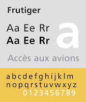
  • Designed by the Swiss type designer Adrian Frutiger in 1968, specifically for use in the French airport. 
  • The purpose is to create a clean, distinctive and legible typeface that is easy to see from both close up and far away. 
  • Consideration / Limitations: Letterforms needed to be recognized even in poor lightings, or when the reader was moving quickly past the sign. 

2. Verdana by Matthew Carter

Fig 1.7 Verdana, Week 4
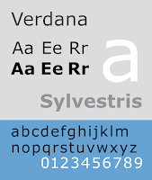
  • Designed by Matthew Carter to address specific technical challenges. 
  • The purpose is to be extremely legible even at very small sizes on the screen due in part to the popularity of the internet and electronic devices.
  • Consideration / Limitations: Verdana exhibits characteristics derived from the pixel rather than the pen, the brush or the chisel. 

3. Johnston Sans by Edward Johnston

Fig 1.8 Johnston Sans, Week 4
  • Designed by Edward Johnston in 1916 with a request for bold simplicity.
  • The purpose is to be used as a new typeface in posters and signage on London's Underground Railway.

General Process of Type Design:

1. Research
2. Sketching
3. Digitization
4. Testing
5. Deploy


1. Research 
  • To understand type history, type anatomy, type conventions, terminologies, sidebearing, metrics, hinting, etc
  • It is important to determine the type's purpose or what it would be used for
  • We should examine existing fonts that are presently being used for inspiration/ ideas/ reference/ context/ usage patterns and more.

2. Sketching
  • Some designers sketch traditionally (brushes, pens, ink and paper) and proceed to digitization by scanning.
  • Some designers sketch using digital tool sets, however this can sometimes impede the natural movement of hand strokes.

3. Digitization
  • In most times, FontLab and Glyphs software are used. 
  • Not only attention should be given to the whole form but also to the counter form in this stage as the readability of the typeface is heavily dependent on it.

4. Testing
  • An important component in the design thinking process. 
  • The results of the testing are part of the process of refining and correcting. Prototyping is one of them.
  • Readability and legibility of the typeface become an important consideration depending on the typeface category ( display type/text type)

5. Deploy 
  • There are always teething problems that do not come to the fore during the prototype and testing stages.
  • The rigour of the testing is important so that the teething issues remain minor. 

Typeface Construction:

Fig 1.9 Construction of grid for the Roman Capital using 8*8 cells, Week 4

Roman Capital
The grid consists of a square with a circle inside that touches the lines of the square in four places. A rectangle with 3 quarters the size of the square is also included within the centre of the square. Using grids with circular forms can facilitate the construction of letterforms and is also a possible method to build/ design your letterform. 

Construction and considerations

Fig 1.10 Classification according to form and construction, Week 4

The 26 characters of the alphabet can be arranged into groups depending on their form and construction, whereby a distinction is made between a group for the capitals and a group for lowercase letters.

Many different forms and constructions must be taken into account when designing a new type. Important visual correction is the extrusion of curved forms past the baseline and cap line, which also applies to vertical alignment between curved and straight forms. 


Fig 1.11 Example of fitting, Week 4

Visual correction is used to correct the distance between letters. It is not possible to place letters next to each other with equal spacing between times, and they must be altered into a uniform visual white space; also known as 'fitting' the type.


Context & Creativity
The need/ motivation of most typefaces can be intrinsic and extrinsic. 

Intrinsic
  • The designer seeks out a form that comes close to fulfilling a desire. 
  • Also possible that the designer identifies a gap/ problem and endeavours to solve it through the design of the typeface.
Extrinsic
  • When the designer has been commissioned or the student-designer was given a task to complete that involves designing a typeface. 
For a designer to be successful, we need to be invested in the idea and understand the requirements, limitations, use, and stakeholders. 


Lecture 05: Perception & Organization


INSTRUCTIONS

<iframe src="https://drive.google.com/file/d/1czvUywyvlXMwGJiaV_bVYhvJHPDAg_zU/preview" width="640" height="480" allow="autoplay"></iframe>
Module Information Booklet

Task 1 — Exercise 1, 2 (20%)
Timeframe: Week 1 - Week 3 (Deadline Week 4)


Exercise 1 — Typographic System (1 week)

In the first exercise, we were instructed to create 8 typographic posters (200 x 200 mm / 300 dpi) by exploring the 8 major systems using the given content, featuring each typographic system per post. We were allowed to use one other colour along with the colour black, with a limited amount of graphical elements including lines and dots. The task is to be done using only Adobe InDesign. 

For the content, we were instructed to select one headline out of the 3 given:
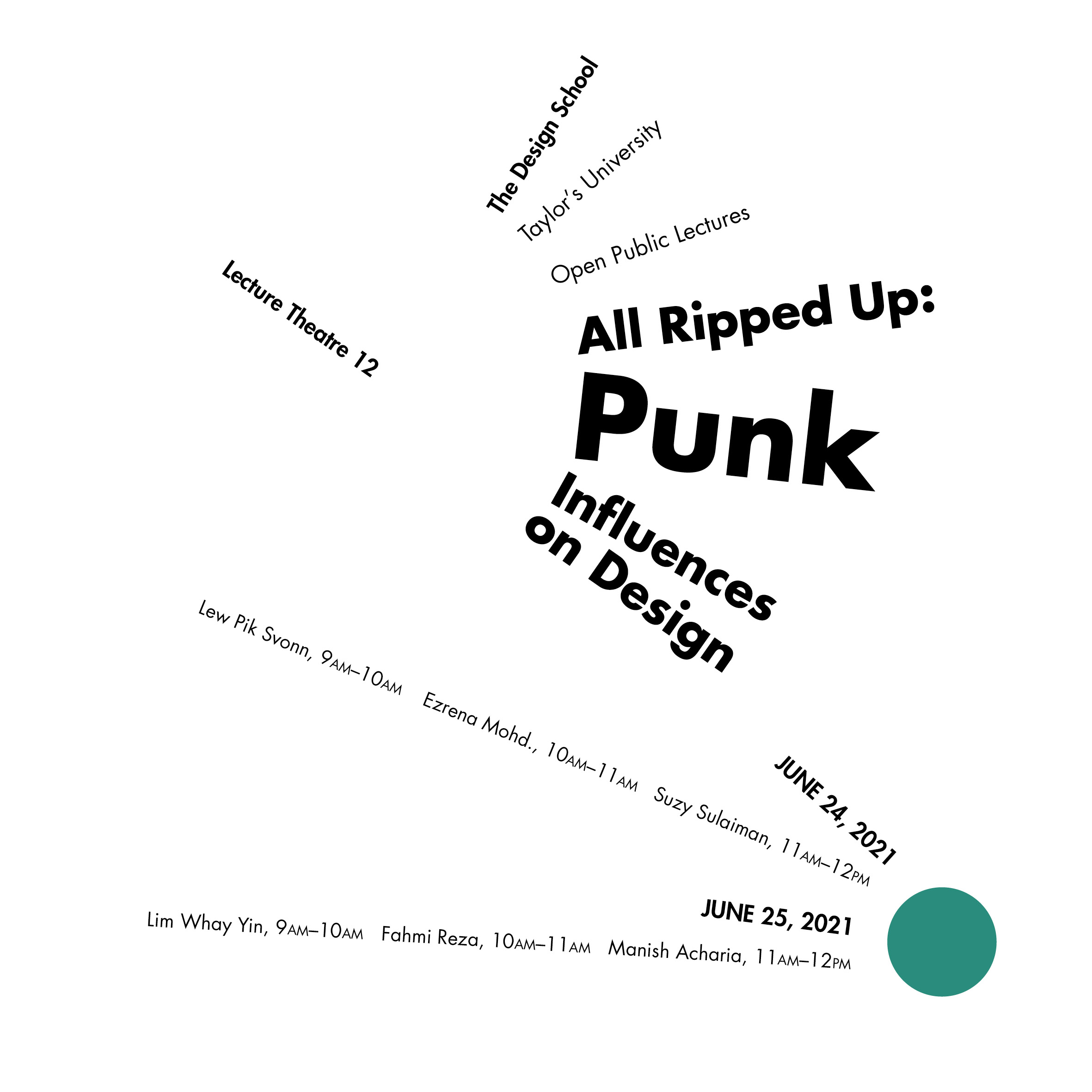
  • All Rippled Up: Punk Influences on Design
  • The ABCs of Bauhaus Design Theory
  • Russian Constructivism and Graphic Design

Content Details:


        The Design School,

        Taylor’s University


        All Ripped Up: Punk Influences on Design

        or

        The ABCs of Bauhaus Design Theory

        or

        Russian Constructivism and Graphic Design


        Open Public Lectures:

        June 24, 2021

        Lew Pik Svonn, 9AM-10AM

        Ezrena Mohd., 10AM-11AM

        Suzy Sulaiman, 11AM-12PM


        June 25, 2021

        Lim Whay Yin, 9AM-10AM

        Fahmi Reza, 10AM-11AM

        Manish Acharia, 11AM-12PM

        Lecture Theatre 12


Final Submission in JPEG file 


Exercise 2 — Type & Play / Part 1 & 2 (2 weeks)

Part 1
In part 1 of exercise 2, we were instructed to extract 4 letterforms from a photograph of our choice. After tracing out rough letterform extraction, we were required to refine those letterforms to a proper consistency of structure as well as maintain the core features of the extraction.


Part 2
In part 2, we were required to create a movie poster using the letterform from part 1. This exercise is to enhance and support the interplay between the letterforms along with the selected image.


Exercise 1 — Typographic System

For the headline of my posters, I decided to go with "All Ripped Up: Punk Influences on Design". 


1. Axial
Fonts Used:
Janson Text LT Std (Bold Italic, Roman)
Univers LT Std (Bold and Roman)
Fig 2.1 Axial System, Week 2

For the axial system, I tried using one horizontal line with a branch of slanted line coming from the word 'Up', as I wanted to make the following word 'Punk' look as if it was going up to the empty space. 

The layout on the left is my initial design. The one on the right is a slightly adjusted version in terms of balance and hierarchy which I decided to move some of the text information to the left side of the axis so that it is not too heavy on the right.


2. Radial
Fonts Used:
Futura Std (Bold, Heavy, and Book)

Fig 2.2 Radial System, Week 2

For radial, I used mainly two circle shapes to pivot and spread out the text information. I removed the bigger circle shape so that the main emphasis is on the headline of the text rather than the shape itself. The smaller circle with colour is meant to grab the viewer's attention after reading the headline so the necessary information can be taken although its small text size.


3. Dilatational
Fonts Used:
Gill Sans Std (Bold Italic, Bold, and Regular)

Fig 2.3 Dilatational System, Week 2

In the dilatational layout, I used the text information for the lecturers and times to create a sense of division between the headline and the venue. Colours are used to highlight certain words that I wanted to emphasize.


4. Random
Fonts Used: 10 fonts / Futura for detailed information


Fig 2.4 Random System, Week 2


Fig 2.4.2 Random System (Colour Inverted), Week 2

For the random system, I was inspired by the logo of the English rock band 'Sex Pistol' with other punk designs like ransom note effects that can complement the meaning of the headline.

Initially, for random, I used a white background underneath the layout. However, it seemed that the colour-inverted version helped to create a sense of completion and emphasized the lecturer's information even more, so I decided to go with my second attempt on Random.


5. Grid
Fonts Used:
Univers LT Std (Bold, Roman, and Light)

Fig 2.5 Grid System, Week 2

For the grid system, I used 3x3 squares to place the text information. 


6. Modular
Fonts Used: Univers LT Std (Roman, Light, Light Oblique, Bold)

Fig 2.6 Modular System, Week 2

For the modular system layout, I decided to remove the vertical lines side by side (on the right) to create a sense of openness. The straight lines help to lead the viewer's attention to read the information one by one.


7. Transitional
Fonts Used: 
ITC Garamond std (Bold, Book, Bold Italic) 

Fig 2.7 Transitional System, Week 2

For the layout of the transitional system, I was inspired by the traditional Asian mountain paintings as I liked their connectivity and fluidity.


8. Bilateral
Fonts Used: 
Univers LT Std (Roman, Bold)

Fig 2.8 Bilateral System, Week 2


Final Outcome of Typographic System

Fig 3.1 Axial System Final, Week 2

Fig 3.2 Radial System Final, Week 2

Fig 3.3 Dilattional System Final, Week 2

Fig 3.4 Random System Final, Week 2

Fig 3.5 Grid System Final, Week 2

Fig 3.6 Modular System Final, Week 2

Fig 3.7 Transitional System Final, Week 2

Fig 3.8 Bilateral System Final, Week 2


Fig 2.9 Typographic System Final (JPEG), Week 2

Fig 2.9.2 Typographic System Final (Grid / Baseline), Week 2 


Exercise 2 — Type & Play Part 1 / Finding Type

Finding an Image
To begin with exercise 2, we were instructed to select an image that contains potential letterforms. I chose to extract from a photograph of a dry leaf as the letter D was strongly visible at the centre of the leaf and its curvy lines that connect the pointy ends represent the features of a dry leaf well as a whole. 

Fig 4.1 Chosen image, Week 3 (8/05/2024)
Extraction
Below is my extraction of the letters L, A, D, and Z:

Fig 4.2 Letterform Extraction (L, A, D, Z), Week 3 (8/05/2024)

Refinement Process


Fig 4.3 Reference Font, Week 3 (8/05/2024)

For font reference, initially, I was going to use a blackletter typeface by referring to the shape of my extraction, however, due to its complex structure, I changed my reference typeface to Brasika display. This way, my base reference was simpler, giving me clearer direction on my further refinement. 

Fig 4.4 Before and After font reference, Week 3 (8/05/2024)

When referring to the existing font, I focused on the typeface characteristics and tried to follow its flared serif structure whilst keeping the extracted leaf outlines. I also straightened the outer lines to enhance the consistency of each letterform.


Adjusting the letter 'A'

Fig 4.4 Letter A counter adjustment, Week 3 (8/05/2024)

Mr Vinod said the counter of the letter 'a' seemed too decorative, so I simplified the counter shape by removing some of the pointy ends that represent the veins of a leaf. I kept one by each side so that its common feature is still visible.

Below is my refinement process of the extracted letterforms:

Fig 4.5 Process, Week 3 (8/05/2024)


Final Outcome of Part 1

Fig 5.1 Image and Extraction, Week 3 (8/05/2024)


Fig 5.2 Overall Process, Week 3 (8/05/2024)

Fig 5.3 Extracted letterforms (baseline), Week 3 (8/05/2024)

Fig 5.4 Reference font, Week 3 (8/05/2024)


Fig 5.5 Final Letterform, Week 3 (8/05/2024)

 
Fig 5.6 Original extraction (top) and final letterform (bottom) comparison, Week 3 (8/05/2024)

Fig 5.7 Exercise 2 Part 1 PDF Compilation, Week 3 (8/05/2024)


Exercise 2 — Type & Play Part 2

In part 2 of this exercise, Mr Vinod instructed us to create a movie poster using the type designs we had made in the previous part. 

As my letterforms were extracted from a photograph of dry leaves, I looked for images that represented similar expressions and imagery with my type design. I have collected several maple leaf photographs to match my type design, but I decided to use the original photograph again as both of my letterforms and photograph go well along.

Fig 6.1 Collected images, Week 3 (8/05/2024)


Fig 6.2 Original Image, Week 3 (8/05/2024)

Before placing the title onto the image, I used Adobe Photoshop first to make slight adjustments to the image in terms of contrast, saturation, brightness and more. 

Fig 6.3 Adjustment process on Adobe Photoshop, Week 3 (8/05/2024)


Below are the draft layouts of my poster design:


Fig 6.4 Poster Layout #1, Week 3 (8/05/2024)

After placing the edited image, I created a radial gradient over the image so that the texts were more visible and readable. By creating the gradient layer on top I was also able to lead the attention towards the centre of the image where the title (extracted letterforms) was placed.

For the A24 logo, I used the image trace tool to make and expand and reversed its colour to create contrast from the gradient layer.


Fig 6.5 Poster Layout #2.1, 2.2, 3, Week 3 (8/05/2024)

The above layouts were experimental, and I tried applying a halftone effect onto the image along with desaturation. The letterform on the left was done using the Diffuse Glow tool and on the right is a plain colour with no additional effects. Layout #3 was a different attempt at minimalistic style.

Fig 6.7 Chosen poster layout, Week 3 (8/05/2024)

I decided to go with the coloured image as the background along with the texturized letterforms.

Mr Vinod commented that the outline strokes of the title letterform were heavy, so I made a lightweight stroke using the diffuse glow tool but this time, the spread rate is higher compared to the previous version.

Fig 6.8 Stroke Adjustment, Week 4 (15/05/2024)

Fig 6.9 Applying shadows, Week 4 (15/05/2024)

I also used a pen tool and clipping mask tool to cut out the ends of the leaves from the background image to place them over the letterforms so that both image and letterforms interplay. I then duplicated these layers to create shadows below the leaves with the Gaussian blur tool.


Final Outcome of Part 2

Fig 7.1 Finalized Poster, Week 4 (15/05/2024)


Fig 7.2 Finalized Poster (PDF), Week 4 (15/05/2024)


Exercise 2 Final Compilation
  
Fig 8.1 Image and Extraction, Week 3 (8/05/2024)


Fig 8.2 Overall Process, Week 3 (8/05/2024)

Fig 8.3 Extracted letterforms (baseline), Week 3 (8/05/2024)

Fig 8.4 Reference font, Week 3 (8/05/2024)


Fig 8.5 Final Letterform, Week 3 (8/05/2024)

 
Fig 8.6 Original extraction (top) and final letterform (bottom) comparison, Week 3 (8/05/2024)

Fig 8.7 Exercise 2 Part 1 PDF Compilation, Week 3 (8/05/2024)

Fig 8.8 Finalized Poster, Week 4 (15/05/2024)


Fig 8.9 Finalized Poster (PDF), Week 4 (15/05/2024)


FEEDBACK

Week 01

General Feedback:

  • Make concise and precise explanations of your design process. 
  • Make sure to indicate and label each work submission.
  • Familiarize yourself with the 10 typefaces provided.
  • Press Command + Shift + > to increase text size
  • Press Option + bottom arrow key to generate the leading
  • Use the Shift + Return key to avoid a great amount of spacing between sentences in certain information.

Week 02 (Labours Day)

Specific Feedback: -

General Feedback: -


Week 03

Specific Feedback: For letter A, refine the counter to reduce the sense of decorativeness. 

General Feedback: Make sure the text is the first thing seen in the poster– do not make images overwhelming.


Week 04

Specific Feedback

The outline strokes of the letterforms are too heavy, try to make them lighter. Make letterforms interplay with the background image more.

General Feedback

In week 4, we were given an important brief for the next task 2, below is the summary/ notes I took while listening:

  • Begin the task with a mindmap- if the brand is you, what would the mindmap be like. 
  • Synthesize your mindmap- certain things that emerge together / decide the strongest and the most positive things as your branding mask. 
  • Make people see your strength- choose keywords that best represent your strength, and build them based on the keywords.
  • Increase consistency to increase legibility.
  • Use primary colours for marks to increase contrast from the background; pastels are not recommended. The strongest colour at the form, the lightest colour at the background.
  • Create a mood board- collect wordmarks of your flavour and set the art direction in terms of visuals, colour, style, and more.

FURTHER READINGS

Fig 8.1 Typographic Systems by Kimberly Elam (2007), Week 1

Week 01—Typographic Systems by Kimberly Elam, 2007
In the first week of this module, I read Typographic Systems by Kimberly Elam to further discover this week's topic.

Below are some notes I took down while reading:
  • The use of asymmetry results in a relatively simple visual arrangement with heightened visual interest.
  • As radial structures are highly symmetrical, using asymmetrical structures helps to enhance visual interest to the viewers
  • The use of alignment can create order through interior axes in a composition. Grouping arcs of text can simplify compositions.

Week 02—Finding Type: A Novel Typographic Exercise by Mr Vinod Nair
In week 2, we were advised to read Mr Vinod's article for a better understanding of exercise 2, finding type.


Fig 8.1 Finding Type: A Novel Typographic Exercise by Vinod Nair (2023), Week 2

From this article, I was able to get a better direction for this week's task by following the steps provided by Mr Vinod. 

  1. Finding an image.
  2. Deconstructing an image.
  3. Identifying letterforms.
  4. Extracting letterforms.
  5. Identify a reference.
  6. Refining letterforms.
    • Introduce consistency in height, width and contrast.
    • Deliberate on retaining or removing characteristics.
    • Decide what areas require simplification.
Below are some notes I have taken while reading the article:
  • What is important is the observation of the constituent shapes and forms of the object in the image being studied. The nature of the lines, textures and overall form.
  • The reference serves to guide the student toward an overall aesthetic but also serves as a point of reference when determining the shape or form of a letter according to convention.
  • The objective of the refinement process is to refine the letterform to a point where it is consistent, uniform and stylistically similar to the other extracted letterforms.
  • The characteristic need not be faithful to the original extraction and can evolve as long as it retains the essence of its structure and form. 


REFLECTION

Experiences
By completing exercises 1 and 2, I was able to explore the knowledge gained from the lectures by creating 8 different styles of posters and getting to extract letterforms out of an image. In overall, I enjoyed the process of designing and placing each element together to create an outcome as a whole. However, I have also met my limitations– I think that I would have ended up with an improved quality and creative outcome if I had more attempts and experimented with different styles, as I acknowledge that the number of drafts was not enough for exercise 1, which I hope to improve on this in the upcoming tasks to strengthen my creativity. Exercise 2 helped me to focus on the relationship and interaction between the letterform and the image rather than looking into the visually appealing aspect first, through understanding the natural characteristics of its form. I look forward to encountering new limitations of mine and finding a way to solve them through learning and experimenting with my knowledge.

Observations
I found in-class feedback sessions especially helpful for task guidance, with setting the right direction for each exercise, I was able to make improvements and adjustments to my work from time to time within the time given. The feedback Mr Vinod gave to the other friends in class was also useful in enhancing the quality of my work in terms of viewing my work from a third person's perception rather than focusing too heavily on my preferences and likings. 

Findings
The lecture videos by Mr Vinod provided me with the contexts and knowledge related to the topics of the exercises in terms of terminologies and additional information. I learned that keeping this information in mind is important and resourceful during the ideation process as it helps me better understand what I need to achieve for a given topic. 


Comments