Fig1.2 Moodboard, Week 5 (17/05/2024)
Sketches
Fig 2.1 Initial sketches, Week 5 (17/05/2024)
Chosen keywords: Bold, organized, flexible, adaptability,
geometrical
Among the sketches, I decided to go with the rectangular wordmark with
cube letters.
My initial intention was to explore the idea of stretching the shapes
of the cube of each letter to create something unique.
Below is my finalized sketch after some exploration. I chose this
design as it contained both my name in English and Korean (negative
space) which is fun.
Fig 2.2 Final sketch, Week 5 (17/05/2024)
Digitization
Fig 3.1 Digitizing process, Week 5 (17/05/2024)
I began digitizing my sketch by creating blocks of rectangular
letterforms and rounding each letter's corners using the direct
selection tool. The counter of the letters 'e' and 'o' was created
using a stroke tool along with a width tool to create an even and
balanced oval shape.
Below is my first attempt at wordmark digitization:

Fig 3.2 Digitized wordmark attempt #1, Week 5 (17/05/2024)
Mr Vinod commented that there was a lack of consistency and
legibility in my initial design, as the overall wordmark is seen
more of a 'seoy-soon' rather than 'seo-yoon' due to the placement of
the letter 's'.
The main cause of this was that I had 7 letters in my name which
made it difficult to maintain the width of both the top and bottom
rows unless the shapes were squeezed in, so I tried out several
variations using the existing letter designs.
I also decided to remove the inconsistent connection of the letters
to balance out the space between the letters.
Fig 3.3 Wordmark variation explorations, Week 5
(17/05/2024)
Below is my finalized choice of wordmark design with adjustment
processes. I also reduced the space between the letters as it
seemed a little wide.
I twisted the letter 'o' in the centre so that the overall
wordmark is more fun to look at and it also helps to add
uniqueness to my identity. Doing this also brought back the idea
of connectivity in a more simplified way compared to my initial
design.
Fig 3.4 Digitizing process, Week 5 (17/05/2024)
Fig 3.5 Final digitized wordmark, Week 5 (17/05/2024)
Colour Application
For the colour palette, I used several websites like
Colour Hunt and
Coolors to look for
the right colour combinations of my liking. After selecting several
colour palettes I placed them all together and compared how it actually
looked when the colour was applied to my wordmark.
Palettes #1 and #2 were my favourites among all choices. However, the
contrast between all colours was not strong enough when placed one by
one (purple with blue/ almond with maverick). I wanted consistent
contrast among all colours, so I decided to go with palette #1.
Fig 3.6 Color palette exploration, Week 5 (17/05/2024)
I also adjusted the value of the darkest shade to match the
overall idea of "white and blue" with "black and red" as the
initial colours had more red in the darkest shade. Below is the
finalized version of my colour palette:
Fig 3.7 Final choice of colour palette, Week 5 (17/05/2024)
Key Artwork Animation
For animation, I used Adobe After Effects to edit the keyframes
of each letter.
Fig 4.1 Animation process on Adobe AE, Week 6
(29/05/2024)
Fig 4.1 Finalized Animation, Week 6 (29/05/2024)
Task 2A Final Outcome
Fig 5.1 Black wordmark on white background, Week 6 (29/05/2024)
Fig 5.2 White wordmark on black background, Week 6 (29/05/2024)
Fig 5.3 Colour Palette, Week 6 (29/05/2024)
Fig 5.4 Wordmark in actual colours on lightest shade of colour
palette, Week 6 (29/05/2024)
Fig 5.5 Wordmark in lightest shade of colour palette on darkest shade
of colour palette, Week 6 (29/05/2024)
Fig 5.6 Key Artwork Animation, Week 6 (29/05/2024)
Fig 5.7 Task 2A PDF Compilation, Week 6 (29/05/2024)
Task 2 (B) – Collateral
Collateral
Below are the links to the websites I used for mockups:
I picked the types of collaterals based on my mindmap, specifically about
one of my strengths "adaptability". I also wanted to choose items that are easily approachable, such as
stationary/ clothing etc. Therefore I chose stickers and tape as a
representation of "being able to stick anywhere".
All of the mockups were done using Adobe Photoshop with patterns and
design layouts prepared using Illustrator.
In addition, I created several variations that could be used for further
identity expansion in mockup designs:
Fig 6.1 Wordmark Variations, Week 7 (4/06/2024)
Collateral #1 Sticker Pack
The first mockup I chose was a sticker pack. After finding a suitable
mockup model for my designs I began by creating several sticker designs
and tried placing them together to find which ones suit the
best.
At first, I tried making them stand out as individual designs but to keep
the consistency and harmony of my identity, I got rid of this idea and
maintained the same design but in different colours so that it is more
easy to recognize at once.
Fig 6.2.1 Sticker layout designs, Week 7 (4/06/2024)
Fig 6.2.2 Collateral #1 Stickers, Week 7 (4/06/2024)
Collateral #2 T-shirt
For the second collateral, I created a repetitive pattern using the
letter 'O's.
Fig 6.3.1 T-shirt pattern design, Week 7 (4/06/2024)
Fig 6.3.2 Collateral #2 t-shirt, Week 7 (4/06/2024)
The third collateral was created with a duct tape mockup model. For the
layout design, I created 2 different patterns for the tape surface part
and the inner backing part of the tape. To create patterns like the one
below, I used the pattern tool on Illustrator with my wordmark arranged
into a horizontal line.
Fig 6.4.1 Duct Tape pattern designs, Week 7 (4/06/2024)
Fig 6.4.2 Collateral #3 Duct tape, Week 7 (4/06/2024)
After finalizing, I cropped the mockup images to fit the Instagram
grid:
Fig 6.5 Finalized collaterals (cropped), Week 7 (4/06/2024)
Identity Expansion & Instagram Tile Design
1. Initial Developments
Colour Palette
Fig 7.1 Colour Palette, Week 7 (4/06/2024)
Firstly, I began by applying a gradient effect to my colour palette. I
made four separate gradient elements by colour to avoid colours from
over-blending as I wanted to maintain the proportion and dividing line
of the palette. After adding a base gradient, I used the grain tool to
apply some texture to the palette.
Black & White Photograph
Fig 7.2 BNW Photo, Week 7 (4/06/2024)
Unfortunately, my black and white photograph was low-resolution when
placed next to my other tiles. So I used the halftone effect to make
the photograph sharper and I thought that the halftone dots enhanced
the contrast from my wordmark which made it stand out more.
Patten Expansion
Fig 7.3 Upgrading pattern design, Week 7 (4/06/2024)
I decided to keep the same pattern design that I used in collateral #2
for consistency. I modified the colour range for this one to look like
the letter 'S' (blue coloured ones), which is the first letter of my
name 'Seoyoon'.
However, the overall look felt incomplete and flat so I attempted to
add a 3D sticker effect by using the mesh tool & pen tools and
gradients in Illustrator. Doing this also provided a connection to the
choice of my collaterals (sticker, tape) and also the letter 's'
representing the verb 'stick'.
Below is my first attempt at Instagram feed layout design:
Fig 7.4 Attempt #1 of Instagram feed layout, Week 7 (4/06/2024)
2. Modification and Adjustments
Adjustment 1
From the above first attempt, Mr Vinod commented that the black and
white profile needs to be taken in front of a white wall; the original
photo was taken against the white wall but due to the halftone effect
and the shadow on the wall, the shade got a little darker.
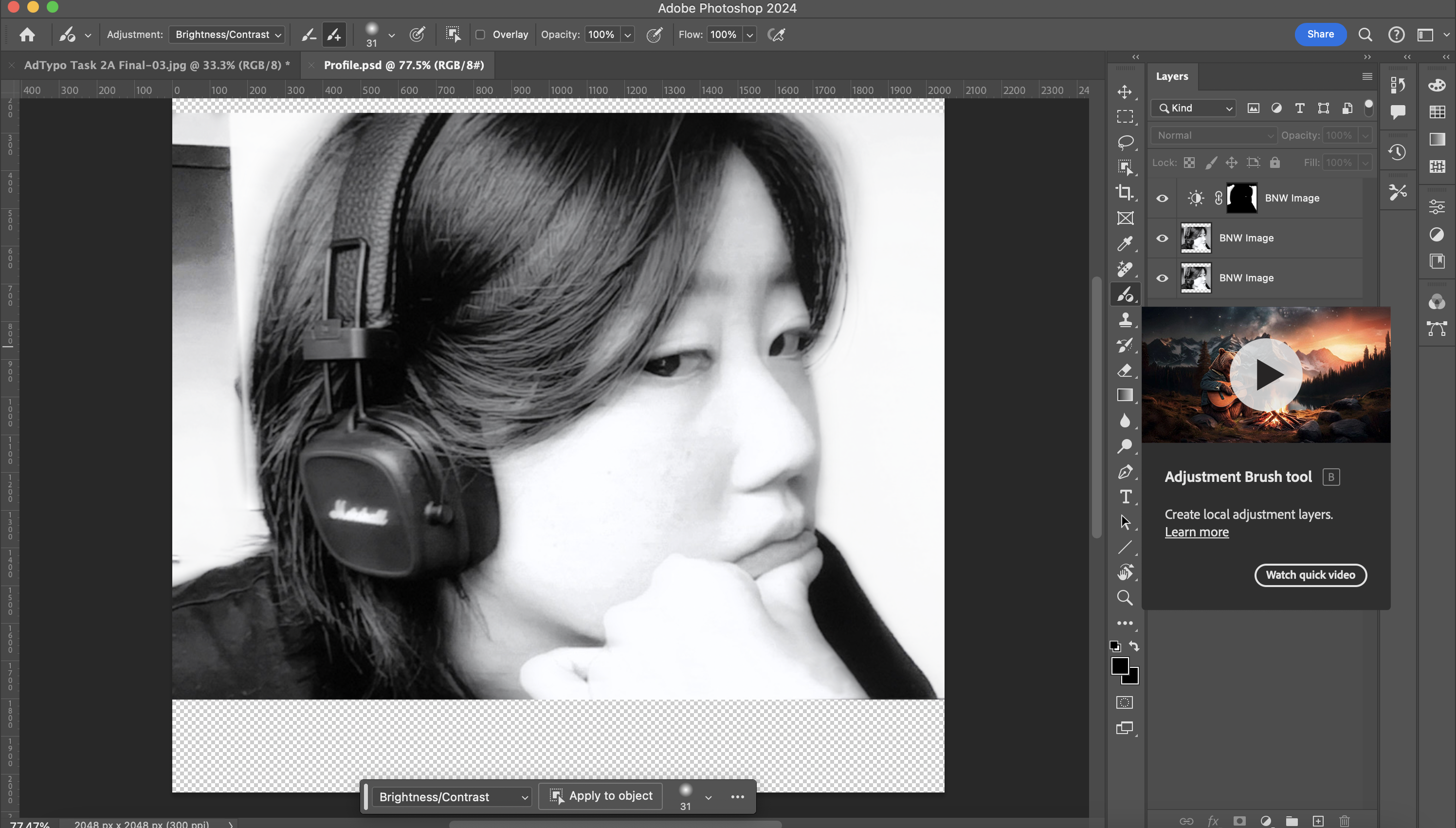
To adjust the brightness of the wall, I used the adjustment brush tool
in Adobe Photoshop to brush the wall area. This tool also has an
adjustment section where I can adjust the brightness and contrast of
selected areas.
Fig 8.1 Adjusting background colour on Photoshop, Week 7
(4/06/2024)
Fig 8.2 Before and after adjusting, Week 7 (4/06/2024)
After some touch-ups, I cropped the photograph based on the Instagram
grid size and applied the halftone effect like the previous one. Below
is the comparison of before and after.
Fig 8.3 Before and after adjusting (Halftone), Week 7
(4/06/2024)
Adjustment 2
I was also given feedback that the pattern work in panel four (left
one below) was too noisy compared to my other layouts. I also realized
that the pattern on the left was more complex compared to the simpler
pattern design on the right.
Fig 8.4 Panel 4 (left), Week 7 (4/06/2024)
Fig 8.9 Tryouts, Week 7 (4/06/2024)
Fig 8.10 Finalized panel 4, Week 7 (4/06/2024)
Above are some layouts I created but eventually discarded as I got
rid of the background pattern and just used my logo with a plain
background instead.
Below is my finalized version of the Instagram feed layout:
Fig 8.11 Instagram Feed Design Layout, Week 7
(4/06/2024)
Task 2B Final Outcome
Fig 9.1 Collateral 1, Week 7 (4/06/2024)
Fig 9.2 Collateral 2, Week 7 (4/06/2024)
Fig 9.3 Collateral 3, Week 7 (4/06/2024)
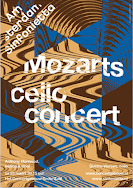
Fig 9.4 Instagram Feed Design Layout, Week 7 (4/06/2024)
Fig 9.5 Screenshot of Instagram page, Week 7 (4/06/2024)
Fig 9.6 Task 2B PDF Compilation, Week 7 (4/06/2024)
Task 2 Outcome Compilation
Fig 10.1 Black wordmark on white background, Week 6
(29/05/2024)
Fig 10.2 White wordmark on black background, Week 6
(29/05/2024)
Fig 10.3 Colour Palette, Week 6 (29/05/2024)
Fig 10.4 Wordmark in actual colours on lightest shade of
colour palette, Week 6 (29/05/2024)
Fig 10.5 Wordmark in lightest shade of colour palette on darkest
shade of colour palette, Week 6 (29/05/2024)
Fig 10.6 Key Artwork Animation, Week 6 (29/05/2024)
Fig 10.7 Task 2A PDF Compilation, Week 6 (29/05/2024)
Fig 10.8 Collateral 1, Week 7 (4/06/2024)
Fig 10.9 Collateral 2, Week 7 (4/06/2024)
Fig 10.10 Collateral 3, Week 7 (4/06/2024)
Fig 10.11 Instagram Feed Design Layout, Week 7 (4/06/2024)
.png)
Fig 10.12 Screenshot of Instagram page, Week 7 (4/06/2024)
Fig 10.13 Task 2B PDF Compilation, Week 7 (4/06/2024)
FEEDBACK
Week 05 (Wesak Day)
General Feedback: Refer to the feedback session held online.
Specific Feedback: -
Week 06
General Feedback: When printing the logotype, print them using the format given to spot
the flaws better.
Specific Feedback: The letter 's' makes the overall word read as "seoy-soon", adjust the
side of 's' to avoid this.
Try making the gap space in between letterforms closer and compare it
to the current version as the gaps now seem quite large. Print it out
and compare the two versions.
Week 07
General Feedback: Read the website provided to study the identity expansion.
Specific Feedback: Retake the photograph with a white wall as
a background.
Panel no.4 seems too noisy compared to the rest of the designs.
Reduce noisiness on panel no.4 and make it simpler.
FURTHER READINGS

Fig 11.1
Typographic Design: Form and Communication by Rob
Carter 2015, Week 5
Week 05— Typographic Design: Form and Communication by Rob
Carter, 2015
In week 5, I read about Typographic Syntax from the above book,
Typographic Design: Form and Communication.
Below are the notes I took down:
Typographic Syntax
- Letter
- Word
- Line
- Column & Margin
The letter: A typographic sign is visually dynamic
because of its interaction with the surrounding void—the white of
the paper. This form-to-void relationship is inherent in the
totality of typographic expression.
The word: The word unit is a constellation of
individual letterforms, suggesting a union and forming a cohesive
whole. Optically adjusted spaces and consistent counterform
relationships assure the overall clarity of this union.
The line: The smallest change in point size, weight, or
line length controls the overall emphasis given to a line of type.
The designer or typographer must determine when the overall effect
is balanced and fully integrated. All design considerations—typeface
selection, alignments, and spacing—should display connections that
are apparent and distinct
The column and margin: Three specific variables related
to columns govern these relationships: the proportion of column
height to width, texture (the tactile appearance of the type), and
tone (the lightness and darkness of the type). It is through the
manipulation of these contrasting variables that pages are spatially
activated, optically balanced, and hierarchically ordered.
Additionally, the height and width of columns (and their adjoining
space intervals) should be carefully examined to ensure adequate
legibility
Week 06—Pentagram Arts & Culture
Fig 11.2 Pentagram, Week 6
In week 6, I read some articles related to identity expansion to
help with my task 2B. The website I used is called Pentagram which
was recommended by Mr Vinod.
Below are some notes I took down from my observation:
Using complementary colours creates a great contrast. Bigger
colour contrasts give a stronger first impression and attention.
Texture application is also important in terms of creating a
division between the text information and photograph elements,
which is also great for reducing bland/ flat appearance.
Referring to the image on the right (Tote bags), pattern design variations add variety and provide stimulating
impressions to the viewers, especially when applied to
repetitive/ similar collateral.
Placing different elements in a repetitive pattern is a good use of
enhancing visual entertainment– it is fun to look at. This can also be
done by colour emphasis.
REFLECTION
Experiences
Overall, task two would be the most entertaining task I have done in this module. I had a lot of fun exploring the idea of relating the identity along with my design style. This task also utilized a number of different creative software tools such as Illustrator, Photoshop, and AferEffects which helped strengthen my software skills as I got to learn some new tools while completing this task. As I am not fully comfortable with using Adobe AfterEffects, I had some problems at the beginning of my animating process, but after some trial and error, I was able to achieve my desired outcome. However, I do think that adding a transition of pattern animation would have enhanced the overall quality of my key animation.
Observations
During task 2B where we were instructed to design our own Instagram page, I was able to compare each of my tile designs to see whether they form a harmony as a whole. In this stage, I was also able to spot the flaws in my design and adjust them accordingly which improved the completeness of the overall outcome.
Findings
Referring to the Pentagram site and many other existing branding designs was helpful throughout completing this task– especially in a way of acknowledging how identity designs are done in real life and finding my way of expanding from this knowledge. I learned that more observations and self-learning from these references make your outcome more diverse and entertaining.


.png)


Comments
Post a Comment