12 / 06 / 2024 — 23 / 07 / 2024 (Week 08 — Week 14)
Kim Seoyoon / 0357755
GCD 61004 / Advanced Typography / Bachelor of Design
(Hons) in Creative Media / Taylor's University
Task 3 / Type Expression and Application
TABLE OF CONTENT
LECTURES
INSTRUCTIONS
TASK 3
TASK 3 OUTCOME COMPILATION
FEEDBACK
REFLECTION
LECTURES
WEEK 01 – 04 LECTURES CLICK HERE
<iframe
src="https://drive.google.com/file/d/1czvUywyvlXMwGJiaV_bVYhvJHPDAg_zU/preview"
width="640" height="480" allow="autoplay"></iframe>
Module Information Booklet
Task 3 — Type Expression and Application (30%)
Timeframe: Week 08 - Week 12 (Deadline Week 13)
Required Submissions:
- A-Z; Numerals; Punctuation
- Link to your .ttf font.
- 5 font presentations (1024 x 1024 px, 300ppi)
- 5 font applications (1024 x 1024 px, 300ppi)
Task 3 – Type Expression and Application
Proposal
In task 3, we were instructed to create a font based on the
three options given:
-
Create a font that is intended to solve a larger problem/ part
of a solution in the area of your interest.
- Explore existing letterforms in an area of interest.
- Experimental design
From the options given, we were instructed to present a
proposal consisting of our ideas related to the topic. Below is
my proposal presentation:
Fig 1.1 Proposal Slides, Week 9
After presenting on week 9, I decided to go with the third idea, which is
a font expansion from my previous task (Key artwork & Collateral) where the wordmark would be my base design.
Fig 1.2 Wordmark design from Task 2, Week 6 (29/05/2024)
Research/ collecting references
As my original wordmark design has a base form of a rectangular shape, so I
looked for a unicase font design for my reference research. Other than that,
I also looked for block/ heavy bold fonts for my visual reference to help
expand the rest of the alphabet letters.
Fig 1.3 References, Week 10
Sketches
Following the initial letterform design, I did a rough sketch of the
structures of my uppercase letterforms.
Fig 2.1 Uppercase sketch, Week 10
Digitization
Rough Digitization
After sketching was done, I imported my sketch onto Adobe Illustrator for
digitization. I first set a fixed-size rectangular shape and used a pen tool
to create a counter shape which was then divided using a Pathfinder
tool.
Fig 3.1 Initial digitizing process, Week 10
Below is my first attempt at uppercase digitization:
Fig 3.2 Digitized uppercase (Attempt #1), Week 10
Feedback and Adjustments
During the feedback session on week 10, Mr Vinod commented that the diagonal
axis in the counter shapes is not at a consistent angle. Some letters also
needed to improve their readability.
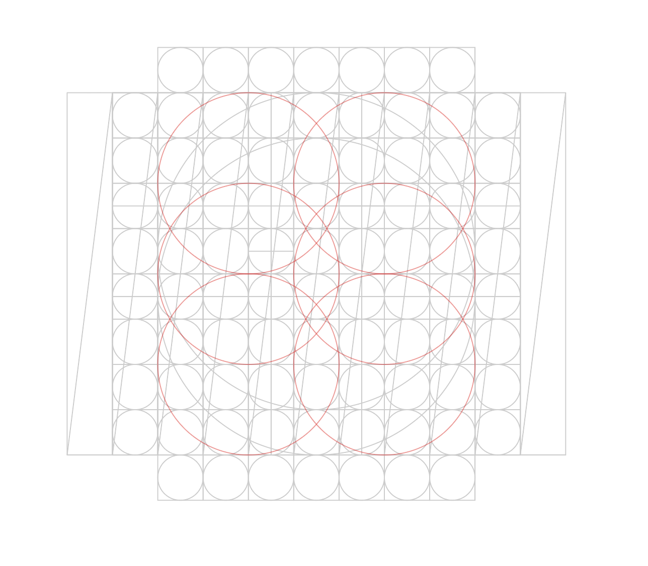
For this case, Mr Vinod taught us how to create a grid structure so that we
could create each letterform at a consistent state. Below is the grid
structure that I created:
Fig 3.3 Grid structure, Week 10
To maintain the same diagonal angle of the counter shape, I used a stroke
tool to set a fixed angle. I also made some modifications to the outline of
the stroke where I rounded its corner and increased stroke weight in the
central part so that it followed the initial design.
After additional settings were made, I set the stroke into a fixed width
profile so that I could apply the same to the rest of the counter shapes on
the letterforms.
Fig 3.4 Countershape making process, Week 11
Here is a side-by-side comparison of the adjustments:
Fig 3.5 Before and after adjustment, Week 11
1. Uppercase & lowercase letters
The above process was repeated for each letterform, where minor changes
varied according to the counter space needed for each letter.
After the placement of the counter shape stroke was done, I used the
Pathfinder tool > Divide tool to take out the counter space and
finalized them with corner rounding.
Below is my step-by-step process aligned vertically for each alphabet
including its experimental process to the finalized version (top to
bottom):
Fig 4.1 Uppercase & lowercase process overview, Week 11
Outline view for more detailed structure overview:
Fig 4.2 Outline view, Week 11
I struggled with the uppercase letters 'G', 'H', and 'I' as the
readability was heavily reduced when I placed the counter space
diagonally– eventually I had to get rid of the diagonal counter and go
with a horizontal/ vertical axis.
Finalized outcome uppercase & lowercase
Fig 4.3 Finalized uppercase & lowercase letterforms, Week
11
2. Numerals & Punctuations
Numerals and punctuations were created using the same method as the
above letterforms.
Initially, I kept the base width the same as lowercase, but eventually,
I decided to go with a more compressed version as some numbers tended to
appear similar to some lowercase letters like the numbers 0 and 6 as 'o'
and 'b'.
Fig 4.4 Base shape for Numerals; Numerals making process, Week 11
Fig 4.5 Punctuations making process, Week 11
Finalized outcome Numerals & Punctuations
Fig 4.6 Finalized numerals & punctuations, Week 11
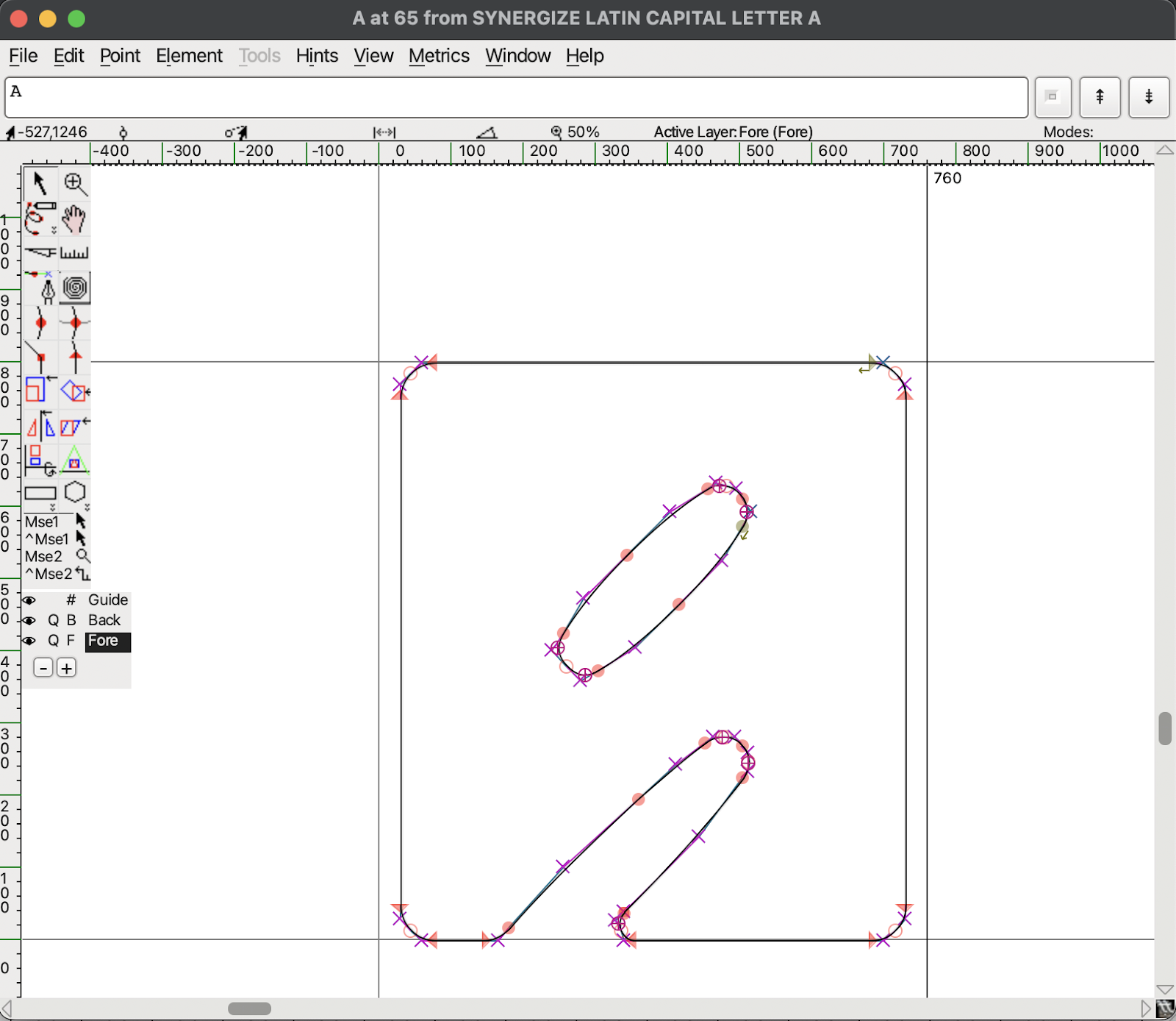
FontForge
To create a font, I used the software called 'FontForge' to import my
letterform designs.
1. Importing letterforms onto FontForge from Illustrator
After finalizing all the cases, numerals, and punctuations, I went onto
FontForge to import the letterforms which I referred mainly to the
post
shared by Mr Vinod on how to utilize FontForge.
Fig 5.1 Asset Export on Adobe Illustrator, Week 12
Firstly, I used the asset export tool to export each of my letterforms
into the asset window and exported them in SVG format.
Fig 5.2 Importing files on FontForge, Week 12
Fig 5.3 Size/ Placement Modification window, Week 12
After categorizing each exported file into its folder, I imported each
letter onto FontForge accordingly. I used the Element > Transformation
> Move & Scale tool to adjust the overall size and placement to the
cap height and x-height.
Finalized letterform importation on FontForge
Fig 5.4 Finalized imported letterforms, Week 12
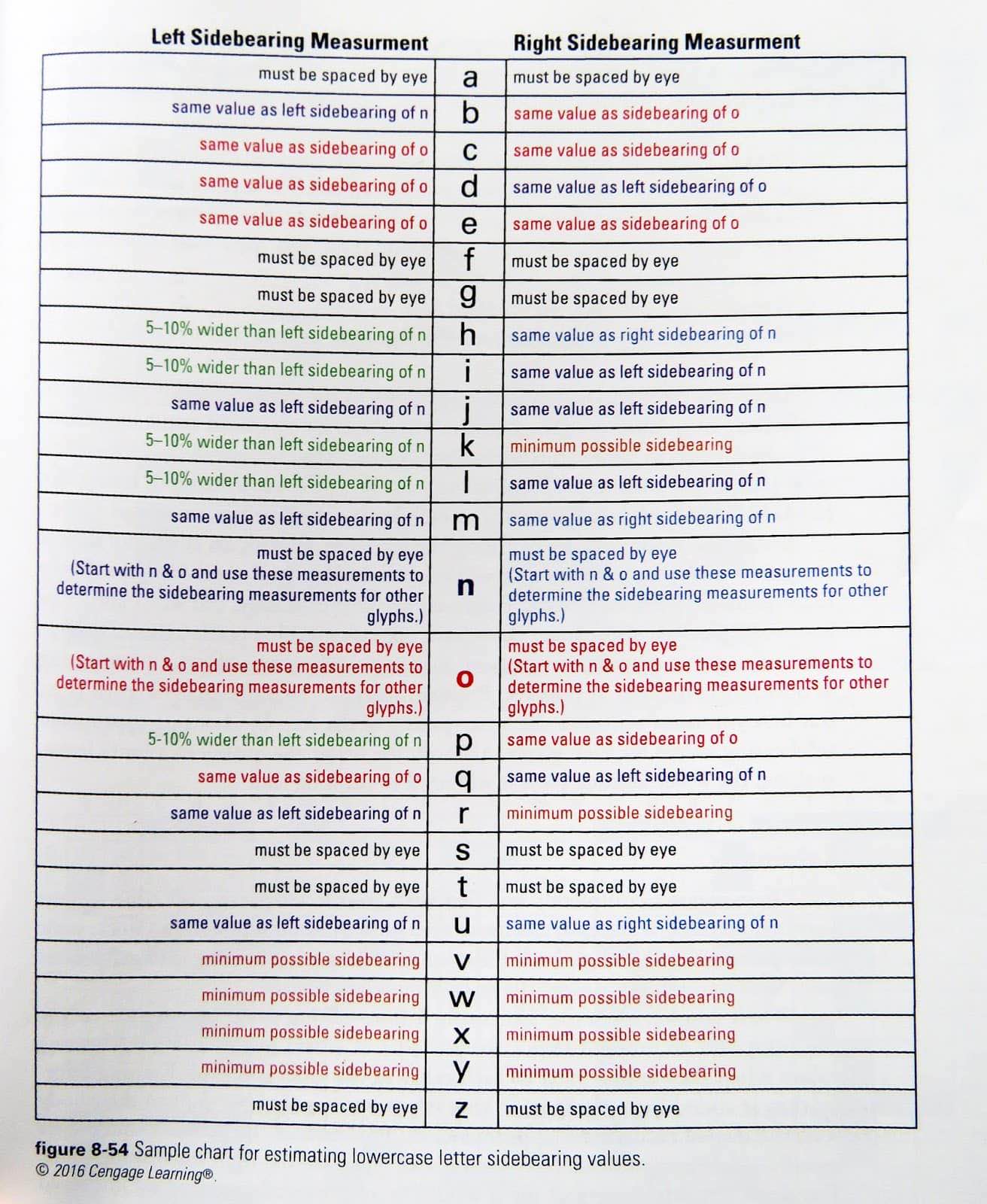
2. Kerning
Fig 5.5 Sidebearing measurement table, Week 12
Lastly, I made sure the kernings in between all of the letters were
relevant according to the table provided by Mr Vinod.
Fig 5.6 Uppercase & Lowercase Kerning, Week 12
Fig 5.7 Numerals & Punctuation Kerning, Week 12
Font Presentation
Before starting to design the layouts for the font presentation, I
created a colour palette so that the overall presentation has
consistency.
Fig 6.1 Colour Palette, Week 13
Fig 6.2 Draft layouts, Week 13
As shown above in Fig 6.2, initially I used the same background colour
for all five presentations. Mr Vinod commented that using a different
background colour for some of the artworks would make the overall harmony
more diverse, therefore I tried utilizing more yellow as the background
colour. Below is the improved version based on the feedback gained:
Fig 6.3 Attempt #2, Week 13
However, I thought that I needed more exploration in terms of the
arrangement of the layouts, so I made some more attempts on the
layouts:
Fig 6.4 More attempts, Week 13
The red box indicates the ones that I selected for final choices. The
first and second rows are the before and after modifications– which I had
to change the colour arrangement on some artworks.
Fig 6.5 More attempts, Week 13
I also made the letters appear more scattered to reduce the stiffness
from the original arrangement. Compound shape tool & offset path tool
were utilized to make each letter slightly stick to each other to match
the idea of 'synergize' so that they appear to make a greater piece as a
whole.
After that, I applied some additional 3d effects using the blend tool.
While in the process of doing this, I also learned that text alignment is
crucial as the direction of the 3d effect might be bent due to bad
alignment (also shown in Fig 6.6)
Fig 6.6 Blend tool, Week 13
Fig 6.7 Punctuation design attempts, Week 13
As for the artwork with the use of punctuation, I tried to make some
variations but eventually discarded them all as I found the original
piece (red box) working more smoothly with the rest of the artwork
compared to the others in Fig 6.6.
Finalized Font Presentation artworks

Fig 6.8 Font Presentation 1, Week 13
Fig 6.9 Font Presentation 2, Week 13
Fig 6.10 Font Presentation 3, Week 13
Fig 6.11 Font Presentation 4, Week 13
Fig 6.12 Font Presentation 5, Week 13
Font Application
For font applications, I wanted to try out creating font applications
based on the concept of a concert/ festival and its merchandise– so I
selected the mockup models such as record vinyl, concert hall, posters,
and other merchandise like keychains and t-shirts.
Fig 7.1 Text/ Necessary elements for mockup, Week 13
All the design layouts for the mockup application were prepared in
Adobe Illustrator and exported to Photoshop for placement. Below are
some of the processes for layout placement in Photoshop:
Fig 7.1.2 Poster Layout, Week 13
For the saturated blue effect, I used a colour fill layer of blue and
applied a blending layer (colour dodge) onto the poster to add in blue
tone.
Fig 7.1.3 Keychain layout, Week 13
Some of my previous designs that were unfortunately excluded from font
presentations were also used in this stage. Again I used a blending
layer to create another set of background colours.
Finalized Font Applications
Fig 7.2 Font Application 1, Week 13
Fig 7.3 Font Application 2, Week 13
Fig 7.4 Font Application 3, Week 13
Fig 7.5 Font Application 4, Week 13
Fig 7.6 Font Application 5, Week 13
Task 3 Final Outcome
Fig 8.1 Finalized letterforms (PDF), Week 13
Fig 8.2 Font Presentation 1, Week 13
Fig 8.3 Font Presentation 2, Week 13
Fig 8.4 Font Presentation 3, Week 13
Fig 8.5 Font Presentation 4, Week 13
Fig 8.6 Font Presentation 5, Week 13
Fig 8.7 Font Application 1, Week 13
Fig 8.8 Font Application 2, Week 13
Fig 8.9 Font Application 3, Week 13
Fig 8.10 Font Application 4, Week 13
Fig 8.11 Font Application 5, Week 13
Fig 8.12 Final Outcome (PDF), Week 13
Font Tester
FEEDBACK
Week 08 (Public Holiday)
General Feedback: -
Specific Feedback: -
Week 09
General Feedback: Refer to the folder provided to see how font presentations were
done.
Specific Feedback: Both the first and third ideas are ok to proceed
with, but the third one (typeface expansion from Task 2) seems more
practical in terms of branding/ identity expansion.
Week 10
General Feedback: Create a grid system as a base underneath your type design so that
all letters are consistent. Place the lowercase side by side next to
its uppercase letters. Try making several words to observe and test
how they actually look when combined.
Specific Feedback: Set a consistent diagonal axis in the counter
shapes. Make sure the letter x is more readable.
Week 11
General Feedback: Use a canvas size of 1000 points when designing the letterform to
avoid resizing at the end.
Specific Feedback: Always set dimensions first before exporting
the letterforms into FontLab.
Week 12
General Feedback: Present certain letters that you find it nice/ pleasing for
presentation. Set a colour scheme before creating the presentations so
that all five presentations are consistent. Refer to the existing font
presentation from others/ pentagram site. Keep typographic systems in
mind when designing font presentations.
Specific Feedback: Try adjusting kerning according to the counter
space of each letter if there is any.
Week 13
Specific Feedback: Mr Vinod commented that all five of my font presentations
have the same background colour and to avoid that as it could
lead to a repetitive design. Wisely use the set colour scheme with variations (background
colours) so that each work is diverse. Compare the outcome of each
artwork to check its harmony.
REFLECTION
Experiences
Overall, it was a great experience creating a design piece
solely utilizing my own abilities; from the font design to
presentation and application provided me new experiences and
skills. However, there were also some hurdles I faced along
with each stage. Importing font to FontForge did take me quite
some time as I needed to resize and place one by one, but I
think it was also a good take trying out a different software
that I have never utilized before.
Observations
I gained a wide range of insight from the observations of
references such as Pentagram, Behance, and more. Comparison of
my own works was also important in this task as it helped me
figure out which points were lacking and what needed to be
changed.
Findings
I learnt to create a consistent pattern in my type design with
the help of the grid method. It was also great to utilize the
font I created in several design presentations as it was the
chance to know how it looks from a different perspective
whilst exploring various layouts.


Comments
Post a Comment