19 / 02 / 2025 — 5 / 03 / 2025 (Week 03 — Week 05)
 Kim Seoyoon / 0357755

Week 04 / Consultation & Development


After showing her our progress, Ms Vitiyaa commented that our overall design lacks consistency in terms of style and colour. She also notified us that we didn't have a brand logo for our project. On the other hand, she advised us to prepare and digitize all work within the semester to avoid getting lost in interest for the next part of the project. Keeping in mind how we would want to present (deliverables) upon our completion is also crucial during this preparation process.


.jpeg)

For the typeface, we looked for a more quirky style for our heading (Lacquer) and a simple sans-serif font for our body text (Faculty Glyphic).

Then I began digitizing them in Adobe Illustrator. For the 3D effect, I overlapped two of the same elements in different colours and applied a blending tool to them. I tried using our brand colour palette for the visuals at first, but after some discussion amongst group members, we decided to use more ranges of colours to add more variety to our visuals.


3. Role Card Design by Rafa


4. Board Design by Graciella

.jpeg)


PRJ 64904 / Major Project I / Bachelor of Design (Hons) in Creative Media / Taylor's University
Task 2 / Design Proposition
TABLE OF CONTENTS
INSTRUCTION
TASK 2 – DESIGN PROPOSITION
WEEK 3 / Presentation Week
WEEK 4 / Consultation Feedback
WEEK 5 / Concept Adjustment & Development
FINAL SUBMISSION
FEEDBACK
REFLECTION
QUICK LINKS
INSTRUCTION
Module Information Booklet
Task 2 – Design Proposition (30%)
Timeframe: Week 03 – 05 (Deadline Week 5)
Students are to carry on from proposal development and continue to develop the final proposal with a comprehensive design proposition. It shall contain the curation of the production process while demonstrating resourcefulness and creativity in effectively channelling and managing resources and potential risks to drive solutions in complex and dynamic environments and/or contemporary real-world settings.
The design propositions need to be justified by the use of a variety of supporting evidence, making appropriate reference to information or analysis that significantly supports the points being made. Students are to demonstrate the culmination of your proposal on how your design solution effectively addresses a specific need in your targeted audience, utilizing a newly created product or service that brings unique social, cultural and/or economic value. The focus will be on your attention to detail and the successful execution of a wide range of conventions particular to your specific area of specialization including organization, content, presentation formatting, aesthetics and style.
TASK 2– DESIGN PROPOSITION
Week 03 / Presentation Week
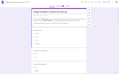
From Ms Vitiyaa's feedback after the presentation, we decided to gather more ranges of data from a target audience research survey. Everyone in our group worked together to create suitable questions to collect the data.

Fig 1.1 Survey progress, Week 3

Fig 1.2 Survey Questions, Week 3
Below is our survey summary:
Fig 1.3 Survey Summary, Week 3
Consultation & Feedback
In week 4, we had a group consultation with Ms Vitiyaa regarding our progress on the project. We updated her about the survey that we created in the previous week, and Ms advised us that we keep the survey till the end of the semester to continue collecting more ranges of answers from different people.
We also showed our first sketches that our groupmates Carmen and Rafa created in the previous weeks:

Fig 2.1 Board Design, Week 4

Fig 2.2 Mini-game Card Design, Week 4

Fig 2.3 Role Card Design, Week 4
After showing her our progress, Ms Vitiyaa commented that our overall design lacks consistency in terms of style and colour. She also notified us that we didn't have a brand logo for our project. On the other hand, she advised us to prepare and digitize all work within the semester to avoid getting lost in interest for the next part of the project. Keeping in mind how we would want to present (deliverables) upon our completion is also crucial during this preparation process.


Fig 2.4 Feedback from Ms Vitiyaa, Week 4
Following Ms Vitiyaa's advice on playing the game to experiment with whether our game system actually functions, we had a quick play session among our groupmates. This helped us a lot in figuring out more straightforward game mechanics, and we came up with a few adjustments in the placement of the features within the board game.

Fig 2.5 Trying out our game, Week 4
Concept Development & Digitization
After the feedback session, we divided our concept development tasks into several parts.
1. Concept Development Roles:
Carmen: Brand logo & Game instructions
Graciella: Mini game instruction & Board layout design
Rafa: Role & heal card illustrations
Seoyoon: Mini-game card illustrations & design
2. Colour Palette & Typeface
To begin with digitization, we decided on our colour palette and typefaces for our board game design. Our colour palette is mainly inspired by the colours of the uniform used in the series "Squid Game".
.jpeg)

Fig 3.1 WHODYTHINKUR? Colour Palettes, Week 4

Fig 3.2 WHODYTHINKUR? Fonts, Week 4
3. WHODYTHINKUR? Instruction Document
Below is the instruction document by Carmen and Graciella that summarises WHODYTHINKUR?'s game mechanics and other instruction details:
Fig 3.3 WHODYTHINKUR? Instruction Booklet (Pre-design version), Week 4
4. Digitizing mini-game cards
For the design of the mini-game cards, I followed our idea from Carmen's sketch designs.
Fig 3.4 Mini-game Card Sketches, Week 4


Fig 3.5 First design, Week 4


Fig 3.6 Recolouring, Week 4

Fig 3.6 Visuals work in progress, Week 4
For type layout design, I tried using a center-align layout for all of the text. However, due to a readability issue, I changed the alignment to left-align so that the instructions could be read more clearly.


Fig 3.7 Working on type layout design (Before & After), Week 4
Fig 3.8 Digitized Mini-game cards (Ver.1), Week 4
5. Other work in progress by groupmates
WHODYTHINKUR? Brand Logo by Carmen

Fig 4.1 WHODYTHINKUR? Brand Logo work in progress, Week 4

Fig 4.2 WHODYTHINKUR? Logotype, Week 4

Fig 4.3 WHODYTHINKUR? Logomark, Week 4
Role Card & Heal Card by Rafa
For role cards, Rafa designed the characters inspired by the series Squid Game and made the card layout like the players' profiles from the series.
Fig 4.4 Role Card Illustrations, Week 4


Fig 4.5 Role Card Designs, Week 4
She also designed a heal card for the game.


Fig 4.6 Heal Card Design, Week 4
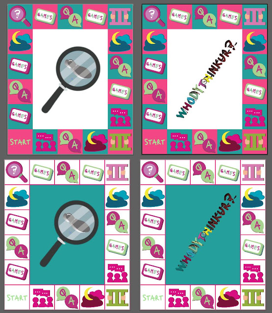
WHODYTHINKUR? Board Design by Graciella
At first, Graciella used colours from the secondary colour palette to lay the tiles on the board, but after some discussion, we decided to go with the pink and green tiles. Each style of the stations' icons is also kept consistent with the 3D blending effect style used in the mini-games.

Fig 4.6 Board Colour Explorations, Week 4

Fig 4.7 Board Element Illustrations, Week 4

Fig 4.8 Board Design, Week 4
Week 05 / Concept Adjustments & Development
Fig 5.1 WHODYTHINKUR? Task 2 Presentation Slides, Week 4
Consultation & Feedback
In week 5, we presented our current progress including the target audience & existing media research and digitized works for our board game to Ms Vitiyaa and Ms Anis.
Upon showing our progress, we were advised to develop our unique identity because our current idea and concept reflect a lot from "Squid Game". They commented that we need our own originality and avoid following the exact content from the series– we were recommended to bring in the South East Asian cultures into our concept so that the players feel more engaged while playing the game.
On the visual aspects of our board game designs, we received feedback that our theme of murder mystery does not portray much of the overall designs, and to improve further from this. This also applied to our logo design as there were simply too many visual elements on the logo which distracts the idea of conveying the feeling of mystery. We were also instructed to keep in mind that our logo designs should be able to be applied to various objects and easy to look at once.
Concept Adjustment
After the feedback session, our group decided to twist some of our concepts and change the following contents:
1. Logo design
2. Mini-game cards design
3. Character design (Role Card)
4. Board colour design
Task Distribution Roles:
- Carmen: Logo design
- Rafa: Role card character design
- Graciella: Board design
- Seoyoon (Me): Mini-game card design, Game Information Booklet
We also added black to our colour palette to enhance the sense of a mysterious feel.

Fig 5.2 WHODYTHINKUR? Task 2 Presentation Slides, Week 4
Visual Developments
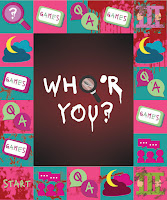
1. Logo Redesign by Carmen
For our logo design, the name 'WHODYTHINKUR?' seemed hard to read by most people, so we decided to go with a simpler word 'WHO 'R YOU?'.


Fig 6.1 Logo revision discussion, Week 5
The magnifying glass has been replaced with the letter 'O' to improve the balance between each letter while keeping them simple and easy to read.

Fig 6.2 Revising Logo on Adobe Illustrator, Week 5
Below is our improved design of WHO "R YOU?'s logo:

Fig 6.3 Revised Logo before & after, Week 5
2. Mini-game Cards
For the mini-game cards, we decided to change a few of the game names to existing traditional Malaysian games that are similar to what we had suggested earlier. I also replaced the back of the card (Rule info side) with a black background to reduce happy & positive energy.

Fig 6.4 Redesigning Mini-game cards, Week 5
We also decided to add some variety to playing mini-game experiences by adding 3 different scenarios for each type of game. We prepared 10 types of games with 3 scenarios for each game, making it 30 cards in total.
The purpose of these scenarios is to make game-play experiences more engaging by reducing the repeatedness of the games so that players feel less bored. I designed 3 different icons that comply with the scenarios:

Fig 6.5 Scenarios for mini-games, Week 5
Below is a comparison example of the previous and updated design for mini-games:

Fig 6.6 Mini-games design before & after, Week 5
Additionally, I also tried adding the blood effect on the card.

Fig 6.6.2 Mini-game card with blook effect, Week 5
Fig 6.7 Mini-game Card Design (Version 2), PDF, Week 5
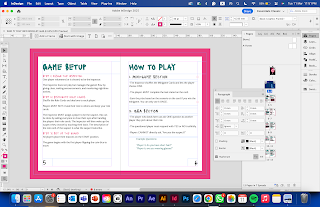
Information Booklet
I also designed a booklet using Adobe InDesign that includes our game mechanics and rules.


Fig 6.8 Info Booklet Design on InDesign, Week 5
Below is the first draft version of our Info Booklet:
Fig 6.9 Info Booklet PDF, Week 5
To reflect local cultures into our design, Rafa changed the design for role card characters inspired by Squid Game to local people we see in our daily lives such as a student, abang grab, teachers, elderly grannies, grandpas, and more.


Fig 6.10 Trying out different layouts for role card, Week 5
Rafa also added blood effects on the back of the role cards to enhance the murder mystery feel.

Fig 6.11 Added blood effect on the back cover, Week 5
4. Board Design by Graciella
As our previous design commented that it was giving off too much happy energy, we tried changing the background colour for the board from green to black& red and white.
To make our designs more consistent, Graciella also added a blood effect on the board.

Fig 6.12 Board design explorations, Week 5
.jpeg)


Fig 6.13 Revised Board Designs, Week 5
5. Deliverables Mock-Up
I also created simple mock-ups using our current designs in Adobe Photoshop.


Fig 7.1 Board Game Packaging, Board Mock-up, Week 5

Fig 7.1 Mini-game Cards Mock-up, Week 5
FINAL SUBMISSION
Fig 8.1 WHODYTHINKUR? Task 2 Presentation Slides, Week 4
FEEDBACK
Week 03
Make sure the board game layout has more options for the players to engage with the game as what we presented previously lacks in its variety. Develop a problem statement on why this board game should be created & designed despite the existence of the current board games.
Week 04
Ms Vitiyaa commented that we fix the colours of the overall design first before digitalizing them, and to have distinctive & consistent styles in the visuals of the mini-game cards.
There is also no brand logo yet for the board game, so do make one to represent the project identity. Also do keep in mind to think of the deliverables on how you would like to present your project to the audience (poster, environmental design, presentation theme etc).
Week 05
- Ensure you complete and prepare all deliverables and what's needed within the semester.
- The overall game concept reflects a lot from the series Squid Game and avoid doing this because people might see our work as just a ripoff. You can keep the colour scheme inspired by the series but do not follow the whole concept.
- Enhance and add a more mysterious side to the visuals as the current design only seems happy without any of the implications of the murder mystery.
- Try to reflect some of the South East Asia/ Malaysia cultures and aspects into the concept design for the characters and game schemes so that people will engage with the game better.
- For logo design, avoid adding too many visually obvious elements and approach for more a simplistic design. Keep in mind the application of the logo to different variables (cards, packaging, board, etc.) and make a logo that applies to all objects.
REFLECTION
Task 2 was when we started working on the visualization and digitization of our project. I was surprised with how much we had made it through here from the initial idea, I think without everyone's constant communication we would not have made this happen. Everyone worked on their distinct role for this project; Carmen worked on the logo, Graciella worked on the board design, Rafa worked on the role and heal card designs, and I worked on mini-game card designs. I am also grateful to receive useful feedback and critiques from Ms Vitiyaa and Ms Anis who guided us through our concept build-ups and lifted up our quality of outcomes throughout the weeks. Working in a group also provides me various insights and viewpoints that I never thought of which allows me to learn in more depth compared to working individually. Although there were lots of changes made throughout the process, I believe that these experiences of learning and experiments will help make various decisions in the future.
Comments
Post a Comment