Brand Corporate Identity / Task 3 Positioning & Identity

04 / 11 / 2024 — 23 / 11 / 2024 (Week 07  — Week 09)

Kim Seoyoon / 0357755

MKT 62404 / Brand Corporate Identity / Bachelor of Design (Hons) in Creative Media / Taylor's University

Task 3 / Positioning & Identity


TABLE OF CONTENT

LECTURES

INSTRUCTIONS

TASK 3

FEEDBACK 

REFLECTION


LECTURES

CLICK HERE TO VIEW WEEK 1-4 LECTURE NOTES


INSTRUCTIONS

Module Information Booklet

Task 3 Positioning & Identity (20% Individual)
Timeframe: Week 07 – Week 09 (Deadline Week 10)

Design relevant applications (business card, letterhead & continuation sheet, invoice) using the logo created whilst guided by the framework identified in the mood board. Design at least 4 collaterals (t-shirt, tote-bag, lapel pins, product packaging etc.), design its digital presence (websites, social media) apply identity as environmental graphics and in simulations (signage, shop front, reception desk) as applicable.


TASK 3 Positioning & Identity

Week 7 / Brand Positioning & Visual References
In Week 7, we had a feedback session on the brand positioning and collected visual references for our brand. Below is my documentation for the contents in Positioning with examples of visuals for my mockup application.

Fig 1.1 Brand Positioning & Visual References, Week 7 


Week 8–9 / Logo Refinement & Mockup Application
1. Logo Refinement
In task 3, Ms Lilian gave us another step to improve and refine what we had created in the previous task. I began refining my logo based on Ms Lilian's post-submission feedback on Task 2:

Fig 1.2 Checklist for Logo Refinement, Week 8 (17/11/2024)

Fig 1.3 Before and After Adjustment (Strapline with Clearspace), Week 8 (17/11/2024)

I decided to go with a shaded version on the side of the box on my logo as it has a better contrast compared to the version submitted in Task 2. I also adjusted the logo strapline according to the Clearspace created from Task 2.

Here is my finalized documentation of refined logos for Task 3:

Fig 1.4 Refined Logo System, Week 8 (17/11/2024)

2. Positioning & Identity Presentation
In the following week 9 after independent learning week, we were instructed to create presentation slides to showcase our brand's positioning, and also some visual references of application examples that inspire our logo application. 

Below is my finalized slide:

Fig 2.1 T3 Positioning & Identity Slides, Week 9 (22/11/2024)

3. Application 
During the independent learning week, we were also instructed to create mockup applications to visualize and support the brand's position and identity. 

Below are the contents needed for us to create:
  • Corporate Stationery (Namecard, Envelope, Letterhead, Invoice)
  • Collaterals (4: CD/ Vinyl Packaging, Postcard, Keychain, Stickers)
  • Digital Presence (Instagram & Website Landing Page)
  • Environmental Graphics (2: Truck, Standee etc)
Initial Mockup Application (Attempt 1) 
Below is my progress on the application in early Week 9, as shown in the feedback comment from Ms Lilian in Fig 2.3, most of my artwork designs for the application were in the wrong format. I was supposed to follow the logo variation that I suggested previously in Task 2 with the correct logo Clearspace margins, but my initial designs were all different, which reduced the consistency of my logo identity. 

She also commented that my designs for corporate stationery lacked brand information such as a contact list and web address, as these materials are used to communicate our brand to the customers.

Fig 2.2 Initial attempt at application, Week 8 (9/11/2024)

Fig 2.3 Initial attempt at application, Week 9 (18/11/2024)

Artwork & Application Adjustments 
To amend this, I followed my brand's logo variations and clearspace to enhance consistent design patterns in my brand. 

1. Corporate Stationery
  • Letterhead & Invoice, Envelope


Fig 3.1 Some of visual references, Week 9 (19/11/2024)

For the overall layout of letterhead, invoice, and envelope, I was inspired by the vintage themed letterhead and invoice designs, where I mainly aimed for a simple and minimalistic design layout with minimized colour schemes of beige and green. 

Fig 3.2 Letterhead deisgn & application, Week 9 (19/11/2024)

Fig 3.3 Invoice design & application, Week 9 (19/11/2024)

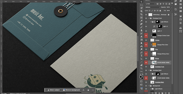
Fig 3.4 Envelope application, Week 9 (19/11/2024)
  • Namecard

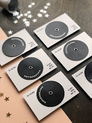
Fig 3.5 Namecard visual references, Week 9 (19/11/2024)

For my name card design, I was inspired by these vinyl record name cards by other music stores. The front cover has the brand logo on black vinyl, while the back cover has an inverted tone, which resembles the shape of an eye from my brand logo. The contact information on the front page also acts as a pattern of record vinyl texture.

Fig 3.6 Namecard Design & Application, Week 9 (19/11/2024)

2. Collaterals
  • CD/ Vinyl Packaging
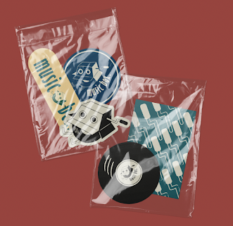
As our brand's music recommendation service is done in blind boxes where customers are given a few choices to pick a CD or vinyl based on their story, I thought that it was good to cover the CDs or vinyl with our brand's own packaging so that what's inside won't be visible. 

Fig 4.1 CD Cover designs (No texture & texture overlay), Week 9 (19/11/2024)

Fig 4.2 CD Cover Application, Week 9 (19/11/2024)

  • Keychain
For keychain design, I applied the vinyl design that I used for the front of my namecard. Different colour for the strap was used for the keychain as I wanted the strap to resemble stylus of a turntable. 

Fig 4.3 Keychain Design & Application, Week 9 (19/11/2024)
  • Stickers
Fig 4.3 Sticker Designs (+Drafts) & Application, Week 9 (19/11/2024)
  • Postcards
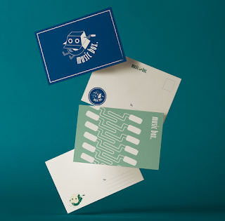
For the last collateral item, I chose postcards so the customers are allowed to send gifts (vinyls) to their friends or family on the other regions to express and share their memories together, and I thought designing a postcard would enhance this service as a whole. 

Fig 4.4 Postcard Designs & Application, Week 9 (19/11/2024)

    3. Digital Presence
    • Instagram
    For Music Box.'s Instagram page, I utilized logo application images of my brand into the posts' thumbnails.

    Fig 5.1 Instagram Page, Week 9 (22/11/2024)

    • Website Landing Page
    For the website design, I used the patterns on top to create a separate division between the header and the body page. Again, I used a minimalistic layout style on the home page with a simple tagline of "Enjoy your time travel at Music Box." 

    Fig 5.2 Web Home, Week 9 (22/11/2024)

    4. Environmental Graphics
    For environmental graphics, I picked a truck mockup and a shop signboard stand that can be placed in front of the truck during business hours. The shop stand also helps as a tool to let customers recognize more easily that our business is open for services.

    Fig 6.1 References, Week 9 (22/11/2024)

    Fig 6.2 Shop Stand Design and Application, Week 9 (22/11/2024)

    Fig 6.3 Truck Design & Application, Week 9 (22/11/2024)


    Final Submission
    1 / Positioning Slide (Brand Positioning + Improved Logo System + Visual References)

    Fig 7.1 T3 Positioning & Identity Slides, Week 9 (22/11/2024)


    2 / Application (Corporate Stationery + Collaterals + Digital Presence + Environmental Graphics)

    Fig 7.2 Corporate Stationery Application (Application & Artwork), PDF, Week 9 (23/11/2024)


    Fig 7.3 Collateral Application(Application & Artwork), PDF, Week 9 (23/11/2024)

    Fig 7.4 Digital Presence(Application & Artwork), PDF, Week 9 (23/11/2024)

    Fig 7.5 Environmental Graphics(Application & Artwork), PDF, Week 9 (23/11/2024)
     

    FEEDBACK

    TO WEEKLY FEEDBACK LIST: CLICK HERE


    Progression Feedback

    WEEK 7 04 NOVEMBER 2024

    FEEDBACK

    • Complete brand positioning, and visual references.


    NEXT PLAN OF ACTION

    • Come up with prepared designs for mockup applications.

    • Brand positioning- Refer to segmentations when writing target audiences. 

    • 4 collateral ideas, social media page(use existing artworks/ patterns/ collaterals for posting), Website page design

    • Environmental design (minimum 2 ideas, advertisement, truck appearance, billboard, posters) 


    WEEK 9 18 NOVEMBER 2024 (ABSENT)

    FEEDBACK

    • Updated application progress via shared drive, Ms Lilian commented that some of the logo usage on the application is wrongly used, such as using a variation of logo that has not been introduced in the previous task, causing the break in consistency pattern in my brand. She also commented that brand contact information is missing in some designs for corporate stationery.


    NEXT PLAN OF ACTION

    • Finalize applications for all 4 sections 

    • Create a slide that presents brand positioning, identity, and visual references with sketches.


    Post Submission Feedback

    Room for improvement in the conceptualisation and wording of brand mission to angle it as practical steps that can be taken to achieve brand’s vision. Missing behavioural segmentation looks at targeted audience. Otherwise, brand positioning slides are completed to the requirement of the brief to a commendable level. Do credit the sources. Missing empty version of corporate stationery letterhead. Able to utilised the right logo versions in the various applications of corporate stationery demonstrating creativity and sensitivity to type placement and scale. In some cases even utilising two versions of brand logo for interest and affirmation of brand identity. Lacking mockup artwork for digital presence outcomes. One leg of the mascot utilised for truck environmental graphics is filled with black (could be a mistake), which is inaccurate to the identity system. Overall, the application design is cohesive and well thought out reflecting the brand’s conceptualised positioning in visual form, which is successfully coupled with creativity and sensitivity towards adherence and accuracy to brand identity.


    REFLECTION

    Experience
    Working on this task was a stage for me to take a look again into what I had progressed so far and refine & improve my brand's identity. This task allowed me to build up various aspects of brand details in the positioning stage and also to bring them to life by visualization through mockup applications and designs using logo variations and colours. 

    Observation
    I also learned that choosing suitable mockup application models is crucial in this task as those objects are meant to best represent the brand's service and what the brand looks forward to convey its vision and mission towards the customers.

    Findings
    Paying attention to the details and keeping the rules of logo placements when designing an artwork was very important for me as it helped me to design various versions of application artwork while keeping brand consistency at the same time. 


     TO TASK 2                                                                                                                                        TO TASK 4 →

    Comments