3 / 07 / 2024 — 10 / 08 / 2024 (Week 11 — Week 15)
I was also inspired by the homepage structure of the official Gorillaz Website. There are no additional sections other than this main page featuring their music videos. The simplified navigation menus are effective for first-comers to discover Gorillaz's activities.
5. Coding
HTML Coding & CSS
Kim Seoyoon/ 0357755
GCD 60904 / Interactive Design / Bachelor of Design (Hons) in Creative Media / Taylor's University
Final Project / Creating a Single-Page Website
Table of content
INSTRUCTIONS
FINAL PROJECT
FEEDBACK
INSTRUCTIONS
Module Information Booklet
FINAL PROJECT
Creating a Single-Page Website (30%)
Task Instruction
Project Overview:
In this web design project, you will create a single-page website dedicated to your favourite topic. This project will help you develop your web design and development skills while allowing you to showcase your passion for the topic of your choice.
Project Requirements:
Artist Selection: Choose your favourite topic as the subject of your website. Ensure you are genuinely interested in the topic, as this will help you create a more engaging website. Decide the site's goal to ensure that the site has clear content.
Content:
Your content should have at least 5 sections that explain the topic of interest. It should engaging and significant to the topic. You should also include one CTA button that reflects the content.
Design Elements:
Choose a colour scheme and fonts that reflect the artist's style or your taste.
Ensure a visually appealing layout with a balanced use of text and multimedia.
Create a responsive design that adapts to different screen sizes (mobile-friendly).
Navigation: Implement smooth scrolling navigation or a simple menu that allows users to jump to different sections of the page.
Interactivity: Consider adding interactive elements such as image sliders, hover effects, or lightboxes for multimedia content.
To begin with the final project, we were instructed to prepare a planning including chosen themes and structure of the website.
1. Content Structure
Topic: Music band 'wave to earth' Fan page
Objective of the website:
- To provide all of the information about the band on one page so that new people have more easier approach to what the band 'wave to earth' does.
- To match the band's visual concept and theme infused into the design of the website.
Overall page contents:
- Header (Logo/ navigation menu)
- Hero Section/ Home (Main Photo background/ brief explanation/ CTA: Listen Now!)
- About the artists (Profile photos/ links to social)
- Discography (Album jacket/ tracklist/ embed YouTube music video)
- Full Album
- EP
- Tour event schedules (Tour photo/ Book now button leading to their booking page)
- Sign Up now! (For new release/ event news updates)
- Footer (Navigation buttons & links to official social platforms such as Instagram, YouTube etc)
2. Visual References / Design Inspiration
Fig 1.1 Released singles & album jackets of wave to earth, Week 11
Each of the sections (albums) will feature its design layout according to the style of the album jackets.
Fig 1.2 Gorillaz Official Website, Week 11
3. Moodboard & Colour Scheme
Main theme - wave (ocean)
- Minimalist layout design
Fig 1.3 Moodboard, Week 11
Primary: Black & white (background colour)
Secondary: Grey
For the colour scheme, I was inspired by the colour schemes in wave to earth's latest album cover. Other than the ones listed above, additional colours (mostly on background photos) will be used to emphasize band group photos.
Font choices
Header/ Body Text: Lexend Deca
4. Wireframe Sketches & Prototype
Below are my wireframe sketches where I explored some different layouts in terms of the placement of each content and their design.
Fig 2.1 Sketches, Week 11
After finalizing the wireframe sketch, I moved on to Adobe Xd to create a prototype version of the website.
Fig 2.2 Prototype on Xd, Week 12
After the feedback session, I decided to do a simpler layout on the "albums" part as the approach I was going for was rather complex and required more skills. Initially, I wanted to contain all of the singles, EP, and full album on the webpage, however, the content length would be too heavy and long if I were to put every one of the songs. Therefore, I modified my idea to focus on the details of the latest album and keep the EPs and Albums only visible on the webpage.
Background Images
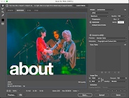
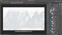
Before translating the contents into HTML coding, I prepared some background images along with their section title on Adobe Photoshop. The band's group photos were collected via screenshots of wave to earth's live concert videos on YouTube which I planned to feature on the web page's albums section as well.
In the editing process, title, gradients, additional filter effects and image adjustments were made. All editing was done within the same Photoshop workplace so that the image dimensions were all kept the same.
The title of each section is intended to be written in all lowercase letters following the concept of the band (band name & album titles written in lowercase).
a) Homescreen & Header (Navigation)
Fig 3.2 Before and After Adjustments, Week 13
Initially, I wanted to use a rectangular card underneath the band's description, but I felt that it would crash with the header if it were to be completely plain blank. Instead, I tried the gradient effect on the header and removed the card underneath the description so that it's more open. For the call to action button which is "Listen Now!", I attached a hyperlink to the button to wave to earth's Spotify page. Below is the process of HTML and CSS codes for this section:
Fig 3.3 Homescreen HTML & CSS, Week 13
b) About
Fig 3.4 About, Week 13
In the members' card section, I inserted a hover effect onto the profile images of the band members to scale up to x1.25 size along with a grayscale filter. The buttons link to their personal Instagram accounts.
Regarding to the responsive code on the background image, I used the code style="max-width:100%;height:auto;" for each image.
Fig 3.5 About HTML & CSS, Week 13
c) Albums
Fig 3.6 Albums, Week 14
As mentioned in the prototype stage, I simplified the number of albums visible on the Albums page– in fact, all of the singles are included within these EPs and Full albums when the buttons below are clicked, leading to the Spotify page that contains the tracklist of each album.
I also added my favourite live video of wave to earth into an embedded video from their YouTube account.
Fig 3.6 Albums HTML & CSS, Week 14
d) Tour
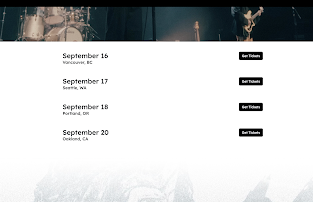
Fig 3.8 Tour HTML & CSS, Week 15
e) Sign Up & Footer
Following the prototype design, I attached the album cover of "flaws and all" underneath the sign-up section with some gradients that flow into the footer of the webpage.
Fig 3.9 Sign Up, Week 15
Final Website Outcome
Link to "wave to earth fan page": CLICK HERE
FEEDBACK
Week 11 – Proposal Consultation
- Make more detailed planning for the hero section (CTA (listen now!) & Main layout)
- Leave the Gorillaz Inspiration layout for next semester as we are focusing on HTML and CSS.
- For the Tour Info section, try to make interactive buttons that lead to the booking website for each location.
General Feedback in class:
- Use a display flex tag so that its easier to manage the file placement.
- Follow the flow of the design- make the settings consistent in the overall layout.
- The body copy should not be very big. Maintain a size of 1em.
- Utilize bootstrap website to easier manage.
- Create a clean, well-arranged layout (12 grid system is usually used in desktop-size site layouts)
overwrite/display to block to block for responsible website
Week 12 – Prototype Feedback
- Try using the accordion component for the albums


.png)


Comments
Post a Comment