Task 03 Type Design & Communication (30%)
Timeframe: Week 07- Week 13 (Deadline Week 13)
Decide whether you wanna go with a lowercase or uppercase design.
- The tool varies/ determines the type of shape of the letterform
- When writing/ exploring make sure you only use one angle for one fixed style.
- When writing in, don't overdo the strokes as this isn't drawing.
In this task, we were given to design and create a typeface.
Research & Exercise
Fig 1.1 Anatomy Of A Typeface, Week 7 (7/11/2023)
To learn about the anatomy and structure of a typeface, Mr. Vinod instructed us to carry out an exercise of directing the letterforms of "H, O, G, B". We were given to select one serif and one san-serif font to study its structure and form.
Fig 1.2 H o g b deconstruction (Futura Std Book), Week 7 (7/11/2023)
Fig 1.3 H o g b deconstruction (Adobe Caslon Pro Regular), Week 7 (7/11/2023)
Sketches— O D H N G
To begin with this task, we were instructed to sketch out the letters o,d,h,n,g using different types of markers. The markers I selected have 3 different nibs, which are brush, chisel, and round type.
Below is the overall look of how the strokes vary according to the type of the marker.
Fig 2.1 Sketch using different marker types, Week 8 (14/11/2023)
After the exploration, we were instructed to select one among the above to proceed to the next step of the task. I liked how the strokes looked using a chisel nib, so I began exploring more using this marker.
Fig 2.3 Sketch Exploration 1, Week 8 (14/11/2023)
At first, I was more drawn to uppercase letters, however, lowercase letters showed more uniqueness and consistency in terms of the direction of the serif and its overall base shape, therefore I selected No.3 from Chisel Nib. Ms. Hsin Yin also commented that the overall structure has the potential to further develop.
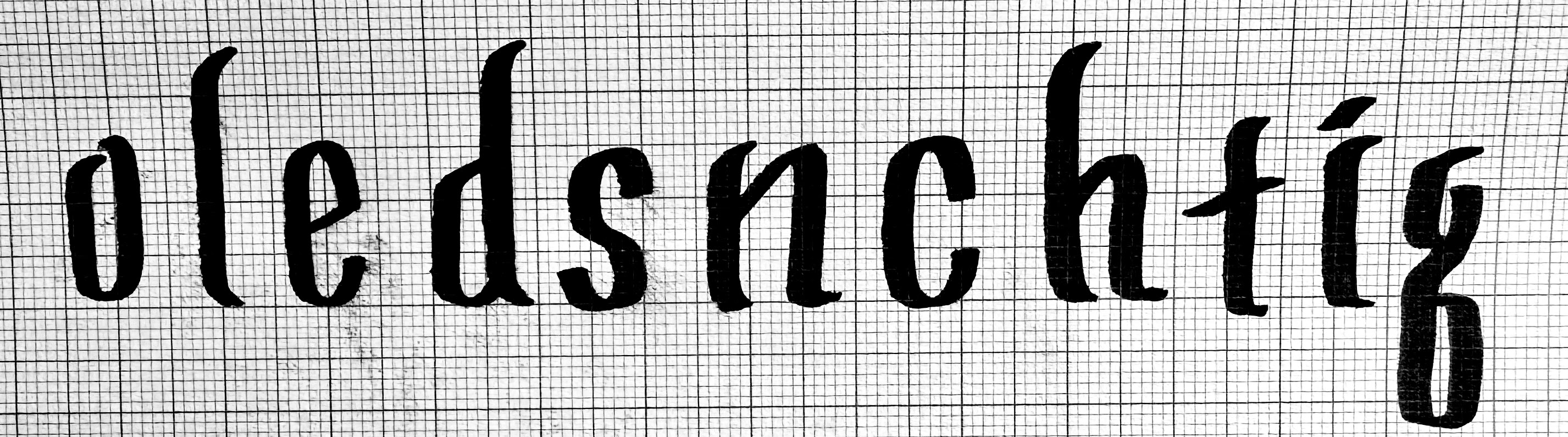
Sketches—O L E D S N C H T I G , . ! #
After deciding on the style, I moved on to sketching the letters o, l, e, d, s, n, c, h, t, i, g, which is an anagram of the name "the design school", and the punctuations , . ! #.
Fig 2.4 Sketch Exploration 2, Week 8 (14/11/2023)
Fig 2.5 Finalized Sketch, Week 8 (14/11/2023)
Fig 2.6 Blackletter Characteristics, Week 8 (14/11/2023)
Ms. Hsin Yin suggested that I should refer to the structure and characteristics of the blackletter as my overall type of construction is similar to the blackletter, as my letters have the shape of a parallelogram as a base structure.
Digitization Process on Adobe Illustrator
I began digitizing in Adobe Illustrator based on my finalized sketch. I applied brush strokes to the original strokes to make my letters have a diagonal shape.
Below is the structure development after each adjustment made.
Fig 3.2 Development Process, Week 9 (21/11/2023)
Fig 3.5 Finalized Version, Week 10 (28/11/2023)
For punctuation, I referred to the
punctuation guide on Instagram shared by Mr. Vinod to enhance consistency.
Fig 3.6 Measurements, Week 10 (28/11/2023)
After finalizing the overall type structure, I measured the sizes of the type such as x-height, cap height, ascender and descender height according to the guide I set at the beginning of the digitization process.
Digitization Process on FontLab 7
In the process of digitization on FontLab, I began by filling up the measurement details to set up guidelines when importing each letter.
Fig 4.1 Measurement Details on FontLab, Week 10 (28/11/2023)
Fig 4.2 Importing letter shapes into FontLab, Week 10 (28/11/2023)
Fig 4.3 Importing letter shapes into FontLab, Week 10 (28/11/2023)
During this process, I removed extra anchor points on Adobe Illustrator before pasting the shape into FontLab to avoid FontLab changing minor details when being imported. Mr. Vinod suggested that I use the shift key to hold the main structure the same while deleting anchor points in between.
Fig 4.4 Side-bearing Chart for lowercase, Week 11 (5/12/2023)
For kerning and side bearings, Mr Vinod provided us with a side-bearing measurements chart that helps us set the kerning more easily. I also made some minor adjustments in the measurements according to the structure of my type.
Fig 4.5 After Kerning (with metrics), Week 11 (5/12/2023)
Fig 4.6 Additional letters with kerning, Week 11 (5/12/2023)
I created and added more letters (v, r, w, p, a, y, m, u) to my typeface for later work which is to create an A4-sized black and white poster using the typeface I designed.
Final Type Outcome— Ignite Regular
Fig 5.1 Ignite Regular Preview on FontLab, Week 12 (12/12/2023)
Fig 5.2 Ignite Regular screengrab on FontLab, Week 12 (12/12/2023)
Ignite Typeface Download Click Here
Fig 5.3 Final Type Construction—Ignite Regular (JPEG), Week 12 (12/12/2023)
Fig 5.4 Final Type Construction—Ignite Regular (PDF), Week 12 (12/12/2023)
Measurements
Black & White Poster
After creating a typeface, we were instructed to design an A4-sized poster. As I named my typeface "Ignite", I wanted to create some sentences that relate to the name of the typeface as well as something inspirational. Therefore I came up with a sentence: "#ignite. light up, your creativity!".
I came up with several design layouts by exploring the typeface placements and utilizing the negative space to create different versions.
Fig 6.1 Poster Draft Designs, Week 12 (12/12/2023)
Fig 6.2 Draft Version 1, Week 12 (12/12/2023)
In the first version of the draft, I wanted the word 'up' to look as if it is going upwards, so I placed it diagonally above the word 'light' and created a line that acts as a connector to the viewer.
The bylines create a sense of closure together with the diagonal line next to it, making it look like a light being shone onto the word 'creativity'.
Fig 6.3 Draft Version 2, Week 13 (18/12/2023)
Version 2 was one of my first try-out designs at the beginning of the poster design process, and Ms. Hsin Yin commented that the repetition of the word 'up' looks interesting to further develop. After receiving some feedback regarding the featuring of all letters (refer to feedback week 13), I made some additional changes in the details of this version.
Fig 6.4 Draft Version 3, Week 13 (18/12/2023)
Version 3 was one of the experimental drafts that I twisted from version 1.
I selected version 2 to be my final choice for submission.
Final Black & White Poster Outcome
Fig 6.1 A4 BW Poster WHITE (JPEG), Week 13 (18/12/2023)
Fig 6.2 A4 BW Poster BLACK (JPEG), Week 13 (18/12/2023)
Fig 6.3 A4 BW Poster (PDF), Week 13 (18/12/2023)
FEEDBACK
Week 08 (Independent Learning Week)
Specific Feedback: -
General Feedback: -
Week 09
Specific Feedback:
- Practice the skeleton (main structure strokes) of the letterforms before to enhance the consistency of the letterforms
- Make sure not all of the letters are hero letters (letters that stand out among other letters). Select a few in a range to stand out and for a clearer readability and recognition of each letterforms.
- Drawing baseline/ x-height lines beforehand helps to create a more consistent letterform in size.
General Feedback:
- Using the stroke tool on Adobe Illustrator is useful when digitizing the sketches.
- Short cut key cmd y for stroke line structure
- Stroke window > Check whether the stroke is the same thickness to avoid weight changes during size adjustments
- To create outlines from the letter strokes: object > path > outline stroke
- The digitized sketch should have raw strokes, an outlined shape, and a united version of the overall letterform to avoid problems caused during the manipulation stage.
- Changing brush type can change the shape of strokes/ edges of strokes (for example, expressing the rough edges from a brush pen
- Make sure to unite the object from the pathfinder tool/ compound path to flatten the objects
- Avoid drawing the letterforms
- Try out different weights within the same writing style.
- Pay attention to the small details when writing thin strokes.
Week 10
Specific Feedback:
- Mr Vinod suggested referring to the post about punctuation design for enhanced stability of punctuations as well as taking a look at other existing typefaces such as Bodoni and Univers.
- As my median was placed higher, Ms. Hsin Yin suggested decreasing the x-height of the letterforms for a more consistent look.
- The overall letterforms (specifically letters 's' and 'e') should follow the base shape structure of my design which is similar to a parallelogram.
- For the letter 'g', widen the bottom part of the letterform horizontally and make the middle line more curvy.
- For the letter 't', the horizontal cross of the letterform should follow the x-height horizontally rather than placing it diagonally.
- The overshoot and x-height of the letterforms should be the same on the letters 'n' and 'h'.
- Reduce anchor points and simplify.
General Feedback:
- Create guidelines (baseline median etc) below the letterforms so that the overall letterforms are placed consistently.
- Make final adjustments to the letterform design.
Things to keep in mind when using FontLab:
- make sure the artboard is 1000x1000 points in size.
- Do not click on "round" when a pop-up window appears to avoid extra adjustments/ disappearance of details.
- In preference, click on AI to ensure the original vector shape is pasted.
Week 11
Specific Feedback:
- Letterforms should maintain the same height according to set x-height.
- Standardize the base shapes of the letterforms based on the chosen letterform so that the counterforms are in consistent shape.
- Try to create several design variables for the letters 's' and 'g' referring to the existing blackletter designs. (e.g structural change in the spine of the letter 's')
- For the dot in the letter 'i', try forming the shape into a diamond/parallelogram shape
General Feedback:
- Make sure all the letterforms have the same weight/ consistency
- Create strokes into paths for further process on Fontlab
Week 12
Specific Feedback:
- Ensure the cross-stroke on the letter 't' sits on the x-height.
- Reduce spine thickness on the letter 's'
- For the letter 's', ensure the beak follows the same structural shape as the rest of the letterforms.
General Feedback:
- Make sure to name the font.
- When composing in poster, the words have to be the same point size.
- Ensure the byline <yourfont's_name><by_your_name>,<2023.> is Univers LT Std. at 8pts.
Week 13
Specific Feedback:
- Ms Hsin Yin commented that the repetition of the letter "up" looks interesting.
- Make sure the poster does not consist of too many graphic elements.
General Feedback:
- The main objective of the BW poster is to promote your typeface.
- Ensure all letters and punctuations are featured in your poster composition.
- Make a final compilation of finalized submissions on your blog.
REFLECTION
Experience
Overall, I enjoyed completing this task as designing our own typefaces allowed us to express our unique styles. Beginning by sketching traditionally on grid paper helped me to be more aware of the details in terms of the serif and stability of its structures. Trying out different angles of brush tools on Adobe Illustrator gives each different appearance of the form, which adds to its interesting features, and it also helped me to proceed faster.
Observations
During the development process in digitization, I paid much more attention to smaller details such as counter forms and the direction of the serif to keep them consistent and stable.
Findings
I learned that creating typefaces requires a lot of attention and time to balance the overall letterforms visually as well as structurally, and keeping its foundational shape that bases the main structure of the letters is important.
FURTHER READINGS
Typographic Design: Form and Communication by John Wiley & Sons, Inc.
Fig 7.1 Anatomy of Typography
Anatomy of Typography p.31
Typographic design is a complex human activity, requiring a
broad background for informed practice. This chapter explores
the basic language of typography. Letterforms, the fundamental
components of all typographic communications, are carefully
examined. Nomenclature, measurement, and the nature of
typographic font and family are presented.
Fig 7.2 Proportion of the letterform


.png)


Comments
Post a Comment