26/09/2023- 24/10/2023 (Week 01 — Week 05)Kim Seoyoon/ 0357755
GCD 60104/ Typography/ Bachelor of Design (Hons) in Creative Media / Taylor's University
Task 01/ Exercise 1 & 2
LECTURES
Week 01: Introduction & Briefing
Development
Week 02: Text_P1
Week 03: Text_P2
Week 04: Typo_2_Basic
Week 05: Understanding
Lecture 01: Introduction
In the first lecture, Mr. Vinod introduced us to Typography, what it is, and how it is used.
- Typography is the act of creating letters; it is the creation of Typefaces or Type families.
Typography is used in various ways:
- Animation
- Website Design
- App Design
- Signage Design
- Bottled Labels, books, and posters
- Logo Type
Typography has evolved over 500 years, from calligraphy to lettering, to typography. Mr. Vinod also taught us about the two terminologies of Typography which are Font and Typefaces.
Fig 1.1 Fonts, Week 1 (26/09/2023)
- Font refers to the individual font or weight within the typeface. For example, Georgia Regular, Georgia Italic, and Georgia Bold.
Fig 1.2 Typefaces, Week 1 (26/09/2023)
- Typeface refers to the entire family of fonts or weights that share similar characteristics or styles such as Helvetica, Times New Roman, etc.
Lecture 02: Development
In this lecture, Mr. Vinod explained the historical development and the timeline of typography. He has also taught us about the importance of the context behind the history.
1. Early letterform development: Phoenicians to Roman
Fig 1.3 4th Century B.C.E. Phoenicians votive stele Carthage, Tunisia, Week 1 (26/09/2023)
In early times, writing meant scratching onto wet clay with sharpened tools or carving into a stone. These letterforms were written in a combination of straight lines and circles, which the structure of the modern Latin letters is derived from the Phoenician alphabet.
Fig 1.4 Boustrophedon, Week 1 (26/09/2023)
Then, the Greeks changed the direction of reading. Unlike reading and writing from right to left like the Phoenicians, Greeks developed a way of reading from left to right, right to left alternatively. This is called
'Boustrophedon'.
Fig 1.5 Development of letterform from Phoenician to Greek to Roman (Left to right), Week 1 (26/09/2023)
2. Hand script from 3rd - 10th Century C.E.
Fig 1.6 Square Capitals, 4th or 5th Century, Week 1 (26/09/2023)
Square Capitals were the written version found in Roman Monuments, the letterforms also have a serif at the edge of the main strokes.
Fig 1.7 Rustic Capitals, 3rd - mid-4th Century, Week 1 (26/09/2023)
Rustic Capitals are the compressed version of Square Capitals. Unlike Square Capitals written at the angle of 60°, Rustic Capitals were written at 30° which decreased the writing time taken. However, the letterforms were harder to read compared to Square Capitals due to their compressed nature.
Fig 1.8 Roman Cursive, 4th Century, Week 1 (26/09/2023)
The use of lowercase letterforms was derived from cursive writing for the purpose of simplification and a faster way of writing.
Fig 1.9 Uncials, 4th - 5th Century, Week 1 (26/09/2023)
Uncials originated from the Latin word 'Uncia' which means a twelfth of anything. It incorporated some aspects of the Roman Cursive hand, especially the forms of A, D, E, H, M, U, and Q. These Uncial letterforms are more easily readable at small sizes compared to Rustic Capitals.
Fig 1.10 Half-uncials, C. 500, Week 1 (26/09/2023)
2000 years after the origin of the Phoenician alphabet, a further formalization of the cursive hand was developed, a formal beginning of lowercase letters.
Fig 1.11 Caroline minuscule, C. 925, Week 1 (26/09/2023)
The figure above shows a text that standardizes the writing system for the purpose of conveying messages more accurately using majuscules (uppercase), minuscule, capitalization, and punctuation which has set the standard of calligraphy for a century.
3. Blackletters to Gutenberg's type
Fig 1.12 Blackletter (Textura), C.1300, Week 1 (26/09/2023)
Fig 1.13 Rotunda, C. 1400, Week 1 (26/09/2023)
In northern Europe, Blackletter, or textura, a condensed strongly vertical letterform gained popularity. While in Southern Europe, 'Rotunda', a rounder open hand was more popular.
Fig. 1.14 Bible page using Gutenberg's Print, Week 1 (26/09/2023)
Johann Gutenberg, who was skilled in engineering, metalsmithing, and chemistry, invented a type mold that accurately mimics the work of a scribe's hand, which made the documenting process much faster as the printing technique was more efficient compared to writing.
4. Text Type Classification
Fig 1.15 Development of letterforms, Week 1 (26/09/2023)
From left to right, these are the development of letterforms from Blackletter to Sans Serif:
- 1450, Blackletter
- 1475, Oldstyle
- 1500, Italic
- 1550, Script
- 1750, Transitional
- 1775, Modern
- 1825, Square Serif/ Slab Serif
- 1900, Sans Serif
- 1990, Serif/ Sans Serif
Lecture 03: Text_P1
1. Tracking: Kerning and Letterspacing
Fig 1.16 Kerning, Week 2 (3/10/2023)
- Kerning means automatic adjustments of space between letters.
- Letterspacing means adding space between the letters.
Fig 1.17 Types of Tracking, Week 2 (3/10/2023)
In typography, not only do we look at the letterform, but we should also look at the counterform of letters in terms of the negative and positive spaces between the strokes.
Fig 1.18 The difference between Normal, Loose, and Tight Tracking, Week 2 (3/10/2023)
Uppercase letterforms are able to stand on their own when being read, while lowercase letterforms require the counterform between each letter to maintain the line of reading.
Referring to Fig 1.18, the text written in loose tracking and tight tracking is much harder to read compared to normal tracking due to difficulties in breaking down the patterns that constitute the words visually.
2. Formatting Text
Fig 1.19 Flush Left Alignment, Week 2 (3/10/2023)
a) Flush Left alignment
- Each line begins at the same point but ends wherever the last word of the line ends.
- The spaces between each word are consistent which makes the type create an even grey value.
Fig 1.20 Centered Alignment, Week 2 (3/10/2023)
b) Centered Alignment
- Imposes symmetry upon text which assigns equal value and weight on both ends of each line.
- Transforms fields of text into shapes.
- Important to amend line breaks for the purpose of avoiding the jagged appearance of text.
- Difficult to read as the starting point of each line is different, suitable for a small amount of text.
Fig 1.21 Flush Right Alignment, Week 2 (3/10/2023)
c) Flush right Alignment
- Emphasis on the end of a line, as opposed to the beginning of the line.
- Used in situations where the relationship between the text and image composition is ambiguous without a strong orientation on the right side, like captions.
- When readability is a priority, should be aware of not putting too much text as it is difficult to read.
Fig 1.22 Justified Alignment, Week 2 (3/10/2023)
d) Justified Alignment
- Imposes a symmetrical shape on the text by expanding or reducing the spaces between the words and letters.
- Might produce 'rivers' of white space running vertically down the text due to the extended space between the words.
- Line breaks and hyphenation is required to avoid this problem.
3. Texture
Fig 1.23 Anatomy of a Typeface, Week 2 (3/10/2023)
Fig 1.24 Difference of grey value between different typefaces, Week 2 (3/10/2023)
Fig 1.24 shows the difference between the contrast of grey values shown using different typefaces. Contrast refers to the thick and thin strokes. Clearer contrast makes the text easier to read.
4. Leading and Line Length
The aim of setting text type is to allow easy and prolonged reading.
Fig 1.25 Examples of variations in leading, Week 2 (3/10/2023)
- Type size should be large enough to be read easily at arm's length.
- Leading refers to the vertical gaps between the lines of text.
- Line Length is the spaces between the left and right edges of a text. An ideal rule of thumb is to keep the line length around 55 to 66 characters.
5. Type Specimen Book
Fig 1.25 Sample Type Specimen Sheet, Week 2 (3/10/2023)
A type specimen book includes samples of typefaces in different sizes which provides an accurate reference for type, text size, type leading, type line length, and more.
Compositional Requirement
- Text should create a field that is able to hold a page or a screen.
- Useful to enlarge a type to 400% on the screen to gain a clear idea of the relationship between descenders on one line and ascenders on the line below.
Lecture 04: Text_P2
1. Indicating Paragraphs
There are various options for indicating paragraphs:
Fig 1.26 Options of indicating paragraphs, Week 3 (10/10/2023)
a) Pilcrow (¶)
- Used to indicate paragraph spacing.
b) Leading
- Used to create line spaces between paragraphs (both line space and paragraph space share the same size which ensures cross-alignment across the columns of text).
c) Standard Indentation
- Shares the same size as the line spacing/ same as the point size of the text.
- Used for the purpose of saving space in the newspaper.
- Best to use when the text alignment is justified to avoid ragging on both sides.
d) Extended Paragraphs
- Creates unusually wide columns of text.
2. Widows and Orphans
Fig 1.27 Examples of Widow and Orphan, Week 3 (10/10/2023)
Designers must take great care to avoid these two gaffes in traditional typesetting; widows and orphans.
Widow
- Short line or type left alone at the end of a column of text.
- This can be avoided by rebreaking line endings throughout the paragraph.
Orphan
- Short line or type left alone at the beginning of a new column.
- Make sure no column of text begins with the last line of the preceding paragraph to avoid this from occurring.
3. Highlighting Text
Different ways of emphasis require different kinds of contrast when highlighting.
- Italics
- Using an increased weight from the same family, making it bold
- Using a different type family
- Using a different colour to highlight (black, cyan, and magenta are suitable)
Fig 1.28 Visual difference between two type family, Week 3 (10/10/2023)
When highlighting the text of a serif typeface to a sans serif typeface, reducing the size of the highlighted text by .5 is suitable for visual cohesion.
Fig 1.29 Difference of maintaining the left reading axis, Week 3 (10/10/2023)
When using a field colour at the back of the text to highlight, maintaining the left reading axis (on the right from Fig 1.29) ensures the best readability.
Fig 1.30 Difference between in/outside placement of highlighted text, Week 3 (10/10/2023)
For certain typographic elements such as bullet points, placing them outside the left margin of the column is required to maintain a strong reading axis.
Fig 1.31 Prime and Quotation Mark (From top to bottom), Week 3 (10/10/2023)
It is important to understand the difference between prime and quotation marks. Prime is used for inches and feet whereas quotation marks are used for quotes.
4. Headline within Text
Below are the following examples A, B, and C according to the level of importance. We need to make sure that these heads clearly signify to the reader the hierarchy of information.
Fig 1.32 A head, Week 3 (10/10/2023)
A head indicates a clear break between the topics within a section. They are a set larger compared to texts.
- Bold and in different type family
- Extended and in alignment with the body of the text
- Larger size in same type family
- Small capitals
Fig 1.33 B head, Week 3 (10/10/2023)
B head is subordinate to A heads. It indicates a new supporting argument or example of the topic at hand. Therefore B head should not interrupt the text as strongly as A head.
- Small capitals
- Italic
- Bold serif
- Bold san-serif
Fig 1.34 C head, Week 3 (10/10/2023)
C head highlights specific facets of material within B head text. They don't interrupt the flow of the reading compared to B head.
- Small capitals
- Italic
- Bold serif
- Bold san-serif
Fig 1.35 Hierarchy, Week 3 (10/10/2023)
5. Cross Alignment
Fig 1.36 Cross Alignment, Week 3 (10/10/2023)
Cross-aligning the headlines and captions strengthens the page's architectural sense and structure. This also creates the last lines of the paragraph from different columns to align together.
Lecture 05: Typo_2_Basic
For week 5, Mr. Vinod introduced us to the basics of Typography.
1. Describing letterforms
There are many terminologies that are related to typography over the time of development. Familiarizing with these terminologies makes it easier to identify the specific typefaces.
Fig 1.37 Optical Adjustment, Week 04 (17/10/2023)
Baseline: The imaginary line with the visual base of the letterforms.
Median: The imaginary line defining the x-height of letterforms.
X-height: The height in any typeface of the lowercase 'x'.
Fig 1.38 Stroke, Week 04 (17/10/2023)
Stroke: Lines that define the basic letterform.
Fig 1.39 Apex/ Vertex, Week 04 (17/10/2023)
Fig 1.40 Terminologies Examples, Week 04 (17/10/2023)
Apex/ Vertex: The point created by joining two diagonal stems. E.g. A, M, and V
Arm: Short stories extended from the stem of the letterform. Two types—horizontal (E, F, and L), or inclined upward (K and Y)
Ascender: The portion of the stem of a lowercase letterform that exceeds the median (above baseline).
Barb: The half-serif finish on some curved stroke. E.g. C, G, and S
Beak: The half-serif on horizontal arms. E.g. E, T, and L
Bowl: The rounded form that describes a counter. The bowl can be opened or closed.
Bracket: The transition between the serif and the stem.
Cross Bar: The horizontal stroke in a letterform that joins two stems along.
Cross Stroke: The horizontal stroke in a lowercase letterform that joins two stems along.
Crotch: The interior space where two strokes meet.
Descender: The portion of the stem of a lowercase letterform that is placed below the baseline.
Ear: The stroke extending out from the main stem or body of the letterform.
Em/en: The width of an uppercase letter 'M'. Em-dash (—) is the width of the letter 'M,' while En-dash (-) is half the size of an em.
Finial: The rounded non-serif terminal to a stroke.
Ligature: The character formed by the combination of two or more letterforms.
consider the glyphs of two ends of the letters to avoid the clash of two letters placed next to each other.
Stress: The orientation of the letterform indicated by the think stroke in rounded forms.
Terminal: The self-contained finish of a stroke without a serif. Terminals come in flat, flared, acute, grave, concave, convex, or rounded as a ball or a teardrop.
2. The font
It is important to utilize the full font and should know how to use it when working with type. It is good to choose a type family that includes a wider range of typefaces for a better outcome.
Fig 1.41 Uppercase, Lowercase, Small Capitals (top to bottom), Week 04 (17/10/2023)
Fig 1.42 Comparison of size between lowercase and small capital, Week 04 (17/10/2023)
Small Capitals
- Primarily found in serif fonts, its uppercase letterforms draw to the x-height of the typeface. This is for the purpose of creating an even grey value so that certain words written in capitals don't stick out from the paragraph.
- Sometimes when certain words are forced to be changed into a small capital when the type family does not have a specific typeface for small capitals, it is suggested to not do it as there will be a change in the weight of the strokes.
Fig 1.43 Uppercase and Lowercase numerals, Week 04 (17/10/2023)
Uppercase Numerals
- These numerals share the same height as uppercase letters and are set to the same kerning width. Known as lining figures.
- Best used with tabular materials.
Lowercase Numerals
- Set to the x-height with ascenders and descenders.
- Also known as old-style figures or text figures, best used with upper and lowercase letterforms.
Fig 1.44 Italic and Roman, Week 04 (17/10/2023)
Italics
- Its forms refer back to 15th-century Italian cursive handwriting.
- Oblique is typically based on the Roman form of the typeface.
Fig 1.45 Punctuation, miscellaneous characters, Week 04 (17/10/2023)
Fig 1.46 Ornaments, Week 04 (17/10/2023)
Fig 1.47 Variations of typefaces, Week 04 (17/10/2023)
: The uppercase forms are derived from the inscriptions of Roman monuments. A slightly lighter stroke in Roman is known as 'Book'.
Boldface: A thicker stroke compared to the Roman form. Also called semibold, medium, black, extra bold, or super depending on the width within the typeface.
Light: A lighter stroke compared to the Roman form. Lighter strokes are called 'thin'.
Condensed: Condensed width form of the Roman form. Extremely condensed styles are sometimes called 'compressed'.
Extended: An extended variation of a Roman font.
4. Comparing Typefaces
Fig 1.48 Range of attitudes of 'R', Week 04 (17/10/2023)
As designers, we need to keep in mind to pick an appropriate type family that respects and correlates with the meaning that we are trying to convey. A good typeface presents the message of the writer.
Lecture 06: Understanding
1. Understanding Letterforms
Fig 1.49 Baskerville, Week 05 (24/10/2023)
The uppercase letterform 'A' above suggests the idea of symmetry, in fact, it is not symmetrical. We can notice that each bracket connecting the serif to the stem of the letterform has an arc.
Fig 1.50 Univers, Week 05 (24/10/2023)
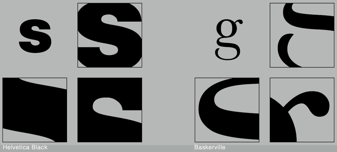
This uppercase letterform shows that the width of the left slope is thinner compared to the right stroke. Both Baskerville and Univers demonstrate detailed care in order to create and maintain harmonious and individually expressive letterforms.
Fig 1.51 Helvetica and Univers, Week 05 (24/10/2023)
Fig 1.52 Differences between Helvetica and Univers, Week 05 (24/10/2023)
We can see the differences in the structure of the lowercase letterform 'a' between Helvetica (left) and Univers (right). We also learn that subtle differences make a huge impact on the readability as well as the outlook of the letters. Consistency and replicating the particular uniqueness are important when font designing.
2. Maintaining X-height
Fig 1.53 X-height, Week 05 (24/10/2023)
Fig 1.54 Median and Baseline, Week 05 (24/10/2023)
Keep in mind that curved strokes, for example, 's', must rise above the median or sink below the baseline in order to look the same size as the vertical and horizontal strokes of other letterforms— to look optically similar in size.
3. Form/ Counterform
Fig 1.55 Counterform (Black Spaces), Week 05 (24/10/2023)
Knowing the negative space/ outer space of letterforms is important as it helps for better readability as well as legibility. Counterform holds a crucial role in being able to recognize the form; the adjustment of space between the letterforms can increase or decrease readability.
Fig 1.56 Font Analysis, Week 05 (24/10/2023)
It is important to look into a closer detail of each letterforms to see how this form is constructed.
4. Contrast
Fig 1.57 Helvetica Bold and Baskerville, Week 05 (24/10/2023)
Contrast is one of the basic principles of Graphic Design. which directly applies to typography. We can learn that simple contrasts create numerous variations such as:
- small + organic
- large + machined
- small + dark
- large + light, and more below
Fig 1.58 Contrast variations, Week 05 (24/10/2023)
INSTRUCTIONS
<iframe src="https://drive.google.com/file/d/1Kh2YTpH0YA6mTp-L1Hg_3OET9qckea4j/preview" width="640" height="480" allow="autoplay"></iframe>
Task 01 Exercises (20%)
Timeframe: Week 01- Week 05 (Deadline Week 06)
Task 01: Exercise 1 — Type Expression
To create and compose the given 4 words. Each design should utilize the given 10 sets of typefaces to express and convey the meaning of the chosen words to become visible — still and in motion.
Task 01: Exercise 2 — Text Formatting
To create a 4 to 5 range of layout design and 1 finalized text formatting layout. The layout should apply the relationship between font size, line length, leading, and paragraph spacing.
Learning Goal- To be able to compose and express using textual information
- To be able to format text for effective communication
Exercise 1 — Type Expression
Type Expression Research
In this exercise, we were instructed to create a type expression design that conveys the meaning of the four selected words. Mr. Vinod provided us several words to select from and I chose Windy, Shock, Illusion, and Stab for my type expression exercise.
I began the first exercise with research on the definition of type expression as well as how it's done by other designers online.
Fig 2.1 Examples of Type Expression, Week 1 (26/09/2023), https://seodesign1.com/type
The figure above shows examples of type expressions from Pinterest. It is noticeable that most of the designs are associated with the idea of movement, emphasis, and utilization of positive/ negative space. I also learned that the details of the placement of letterforms play a crucial role in expressing its meaning.
Type Expression Sketches
Fig 2.2.1 Type Expression Sketch, Week 1 (26/09/2023)
Initial Ideas
I proceeded with initial sketches which I explored various designs that convey the meaning of each word with some variations in terms of the weight and placements of the letterforms. After the exploration process, I came up with one sketch selection from each word.
Below are my selections of sketches and a description for each sketch:
Fig 2.2.2 Selected Sketches, Week 2 (26/09/2023)
1. Windy
For the word windy, I focused on the movement of windy and how the letterforms can correlate with the idea of waviness and the flow as if the letters are about to fly away— the letter 'y' at the end has an extended curve that indicates the movement of the wind.
2. Shock
For the word shock, I used repeated letters 'O' to create a shocked effect along with creating contrast in those repetitions using different weights and tones. I also used a condensed font for this that is vertically long to show an increase in the impact of 'shock'.
3. Illusion
For illusion, the middle of the overall letterforms is slightly stretched forward to the right to emphasize the idea of illusion by utilizing the visual characteristics of the letterforms in the word 'Illusion' which has multiple vertical strokes compared to other words.
4. Stab
For stab, I extended the two ends of the letter 't' to penetrate through the rest of the letters. I sketched a thicker weight of the letterforms in stab to show a contrast between how the letter 't' stabs the other letters.
Digitization—Sketches and Development Process
As Ms. Hsin Yin advised us not to distort the letterforms too much, instead I explored various tools on Adobe Illustrator and applied them to my draft designs while still achieving the idea that I wanted to convey.
Fig 2.3 Digitized Sketches, Week 2 (3/10/2023)
After exploring some variations of digitized sketches, I came up with four selections and began making adjustments for an enhanced overall outlook.
Fig 2.4.1 Selected Digitized Sketches (Pre-adjustments), Week 2 (3/10/2023)
1. Windy
For windy, the edges of each letter of my draft design were roughly connected to each end, so I used a Pathfinder tool along with a pen tool.
Below is my step-by-step process on how I adjusted the edges as well as the comparison:
Fig 2.4.2 Adjustment process on Windy, Week 3 (10/10/2023)
Fig 2.4.3 Comparison of Before and After, Week 3 (10/10/2023)
Fig 2.4.4 Shock Development, Week 3 (10/10/2023)
3. Illusion
Fig 2.4.5 Illusion Development, Week 3 (10/10/2023)
4. Stab
Fig 2.4.6 Stab Development, Week 3 (10/10/2023)
Final Outcome of Type Expression
Fig 2.5 Final Digitized Type Express, Week 3 (10/10/2023)
Type Expression Animation—Process
I decided to select 'Illusion' to proceed with motion work for the next step as I felt that my type expression of 'Illusion' had the strongest impression among the four designs that I created.
I worked on Adobe Illustrator for the motion frames. I used different tones of grey to create a gradient effect as the word 'Illusion' appears on both sides; adding different layers of grey tone helps to soften the transition of the animation.
Fig 3.1 Animation Frames on Adobe Illustrator, Week 3 (10/10/2023)
After I was done with the process of creating frames, I moved on to Adobe Photoshop and created multiple layers that held each frame that I had created previously.
Fig 3.2 Motion process on Adobe Photoshop, Week 3 (10/10/2023)
Fig 3.3 Draft Animation, Week 3 (10/10/2023)
The above GIF animation shows my draft animation on 'Illusion'. Ms. Hsin Yin advised that I should add more sequels to the ending part of the animation where the word Illusion slices into half.
For improvement, I created extra frames in between the sliced transition and repeated the frames so that the word Illusion moves left and right instead of staying still (like the draft animation).
Final Outcome of Type Expression Animation
Fig 3.4 Animated Type Expression of Illusion, Week 4 (17/10/2023)
Exercise 2 — Text Formatting
Kerning & Tracking Exercise
In the first part of exercise 2, Mr. Vinod instructed us to work on kerning using our own names with the given typefaces at the beginning of this module.
Below is my exploration of various font types from each typeface along with the original format (without kerning) and kerning applied to my name:
Fig 4.1 Without Kerning, Week 4 (17/10/2023)
Fig 4.2 With Kerning, Week 4 (17/10/2023)
Fig 4.3 Kerning Comparison, Week 4 (17/10/2023)
Text Formatting Draft Layouts
In this exercise, we were given an abstract of I am Helvetica by John Doe to create layout designs using kerning, tracking, leading, paragraph spacing, and font sizes along with a selection of suitable B&W photography.
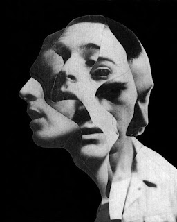
Fig 5.1 Selected photography (by Jesse Draxler), Week 4 (17/10/2023)
Below are my four different draft layouts:
Fig 5.2 Text Formatting Draft Layouts, Week 4 (17/10/2023)
For my finalized layout design, I chose the first layout as it suits the ideal reading direction of the magazine the most which is from the top left towards the bottom right—the paragraph placement and headline lead the reader's eye in a similar way which also relates to readability.
I proceeded to make adjustments to the text formatting in terms of resizing the paragraph spacing, leading, kerning, cross alignment, and turning off hyphenation to further enhance readability.
Fig 5.3.1 Paragraph and Headline Adjustments, Week 5 (24/10/2023)
I have also resized the photography so that it would fit in the margin column along with the paragraph above.
Fig 5.3.2 Photography and Byline Adjustments, Week 5 (24/10/2023)
Fig 5.3.3 Before and After, Week 5 (24/10/2023)
Finalized Outcome of Text Formatting (I am Helvetica)
Fig 5.4 Text Formatting Final (JPEG), Week 5 (24/10/2023)
Fig 5.5 Text Formatting Final (PDF), Week 5 (24/10/2023)
Fig 5.6 Text Formatting Final with Grid (JPEG), Week 5 (24/10/2023)
Fig 5.7 Text Formatting Final with Grid (PDF), Week 5 (24/10/2023)
HEAD
Font/s: Univers LT Std Black Extended (Headline)/ Univers LT Std Bold (Byline)
Type Size/s: 58pt , 90pt (Headline)/ 10pt (Byline)
Leading: 108pt (Headline)/ 12pt (Byline)
Paragraph spacing: -
BODY
Font/s: Univers LT Std Roman
Type Size/s: 8pt
Leading: 10.5pt
Paragraph spacing: 10.5pt
Characters per line: 49
Alignment: Justify with the last line aligned left
Margins: 12.7 mm top, 12.7 mm left + 12.7 mm right + 12.7 mm bottom
Columns: 5
Gutter: 4.223 mm
FEEDBACK
Week 01
Specific Feedback: Add a description to the profile, and update lecture notes for Lecture 01- Development. Add task explanation, research, and letterform sketches with descriptions.
General Feedback: Update what we learn on the e-portfolio consistently to avoid crashes of upcoming tasks.
Week 02
Specific Feedback: Do not distort or add exaggerated effects to the letterform. Sketch again to fit in the typefaces given. Try two or more ideas for "Illusion" for backup.
General Feedback: Do not add illustrations within the typography, only utilize the letterform. Make sure we have a description for each sketch to convey the intention and how the meaning is delivered.
Week 03
Specific Feedback: For the word "Illusion," ungroup the words and slightly move the letter 'N', or remove the small piece to avoid visual noises in the design.
Make sure the edges of each letter are joined smoothly for the word "Windy" by using the pen tool and pathfinder.
For the word "Shock," try creating an illusion effect behind the letter 'O' to enhance the meaning of the word.
General Feedback: Document the process of each work. Consider the hierarchy of the text when documenting on the e-portfolio. Update further readings.
The animation should have 24 frames for smooth movement of the letters.
Week 04
Specific Feedback: Ms. Hsin Yin advised me to add more sequels to the type express animation of the word "Illusion" for enhancement of the meaning of illusion.
General Feedback: Mr Vinod told us to not compile the process photos in Google Drive as it might not be accessible to others, and attach the process photos straight onto the e-portfolio instead. Only the finalized work shall be attached via Gdrive in PDF format.
For Exercise 2, there should be 2 jpg files—with a grid and without the grid. For the finalized work of Exercise 2, submit 2 pdf (with baseline and without baseline) and the overall submission should have 1 layout of 4-5 pages. Document the process in the e-portfolio.
Mr Vinod told us that choosing the right ppi (pixel per inch)/ pixel quality of the exported outcome is important. A pixelated image might lead to mark deduction/ rejection so keep this in mind when exporting finalized outcomes.
Week 05
Specific Feedback: For Task 2 make sure to change the grid systems when changing the font size. Leading should be 2.5 or 3.5 pt larger than the text size.
General Feedback: Consider the hierarchy when placing the heading image in text formatting. Make sure both images and paragraphs are aligned.
REFLECTION
Experience
Overall, throughout completing task 1 of the Typography module I was able to learn the historical development of typography as well as the details that complete the beauty of typography. As a person who is interested in the idea of typographic structures, I enjoyed a lot being able to learn further knowledge on typography and exploring through my creativity skills. I was also able to focus on my tasks better as we updated the work we had done weekly where I received useful feedback and critiques from the lecturers for improvements and development. The tutorial videos uploaded by Mr. Vinod also helped me to adapt to Adobe InDesign and other platforms better as I could follow each step in my own phase.
Observations
As we reviewed our weekly work together in class, the feedback given to them was also helpful for my work, and through this, I learned that there are a lot of various perspectives when it comes to designing. Other people's unique style in their designs has led me to brighten my insights. Similar to this, I also learned that researching plays an important role in the ideation process as it widens my range of creative thinking skills.
Findings
I was interested in how we can still express the meaning of certain words while not distorting or adding visual effects to them and I learned keeping the design principles in mind when designing a typographic work helps a lot. I also learned that text formatting is not just about creating paragraphs, but adding up small details one by one can create an interesting piece of design. There were a lot of new terminologies related to typography that I did not know about and noticed even a small detail can create a huge difference in the overall look of the design.
FURTHER READINGS
A Type Primer by John Kane
The book I decided to read this week is A Type Primer by John Kane. I began with reading the Basics Chapter which includes the basic principles of Typography.
Fig 6.1 Terminologies and Describing Typefaces, Week 1 (26/09/2023)
Fig 6.2 The font, Week 1 (26/09/2023)


Comments
Post a Comment